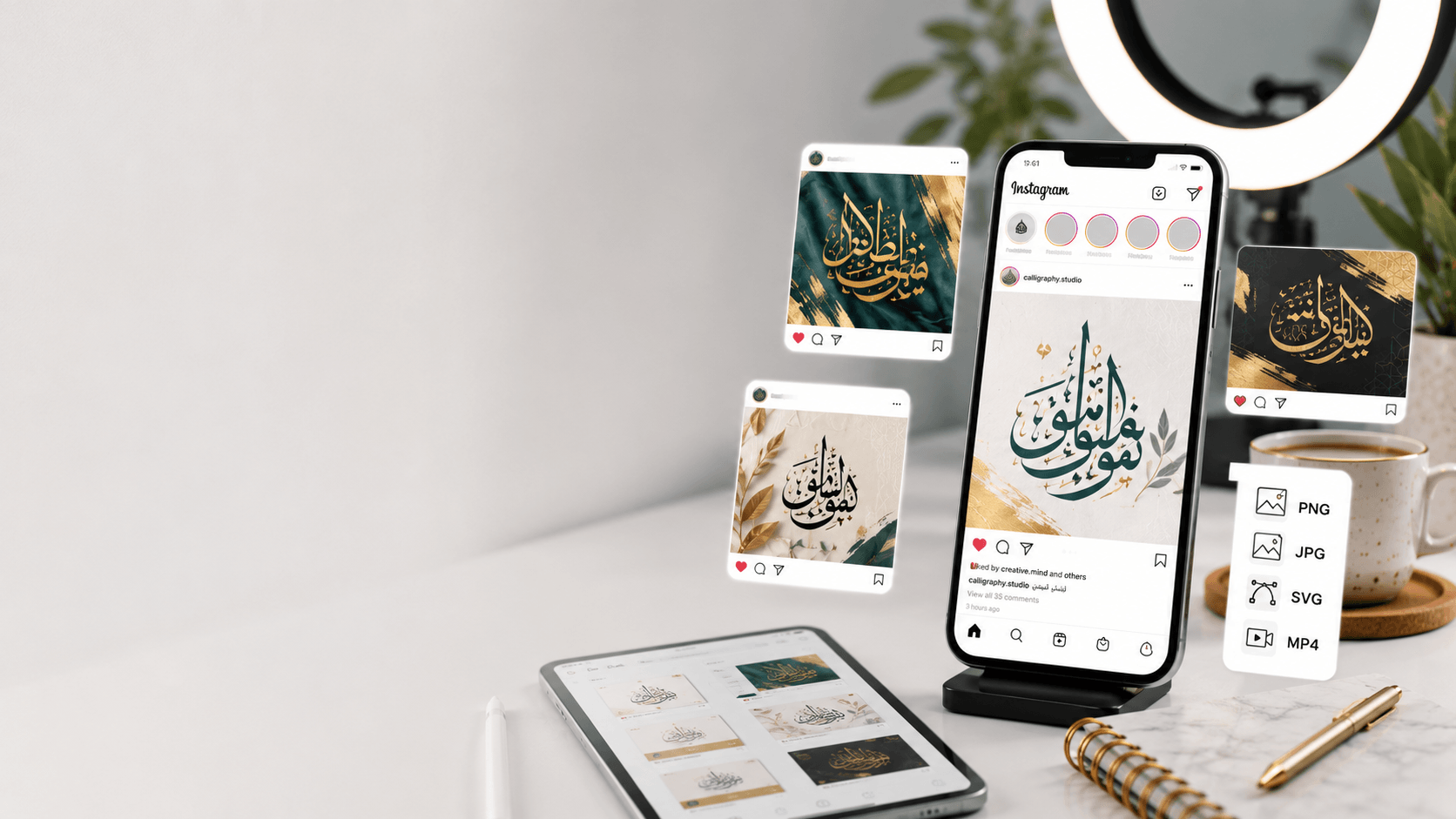
Instagram remains one of the biggest showcases for Arabic calligraphy design — but getting a design from your screen into a post that actually looks sharp requires matching a few technical details most people skip past. This is a step-by-step guide to sizing, formatting, and designing Arabic calligraphy specifically for Instagram's various formats.
The right dimensions for each format
Feed posts (square): 1080 x 1080px is the standard safe size — Instagram displays square posts at this resolution and it works reliably across both the grid view and full post view.
Feed posts (portrait): 1080 x 1350px takes up more vertical space in the feed, which can help calligraphy-heavy posts stand out while scrolling — this is often the better choice for text-forward designs specifically, since it gives your calligraphy more visual real estate.
Stories and Reels covers: 1080 x 1920px (9:16 ratio). Keep any calligraphy you want fully visible within the center-safe zone, since Instagram's UI elements (profile icon, reply bar, progress indicators) overlap the top and bottom of Stories.
Profile picture: Instagram displays profile photos as a circle, so if you're using a calligraphic mark as your profile image, keep the important part of the design centered with generous padding — anything near the edges of a square export will get cropped off by the circular mask.
Export format: PNG almost every time
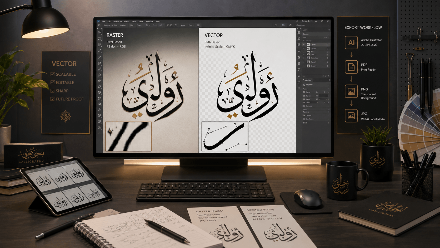
For Instagram specifically, PNG is nearly always the right export choice over SVG, since Instagram (like every social platform) requires raster images for upload — SVG's vector advantages don't apply once the platform re-renders it as pixels anyway. Export at exactly the dimensions above rather than a smaller size scaled up, since Instagram will further compress your upload, and starting from a lower-resolution source compounds that compression into visible quality loss. Our PNG vs SVG guide covers the underlying format differences in more depth if you're deciding between formats for a broader project.
Design choices that hold up in a feed
Instagram is a fast-scrolling environment, which changes what "works" compared to a printed piece someone views up close. Favor higher contrast and simpler backgrounds — a subtle, low-contrast design that rewards close inspection on a wall doesn't get that inspection while someone is scrolling past it in half a second. Bolder styles (Kufic, Thuluth) tend to perform better than fine, delicate scripts (intricate Diwani-style flourishes) specifically because bold shapes register faster at thumbnail size, which is how most people first encounter a post before tapping in.
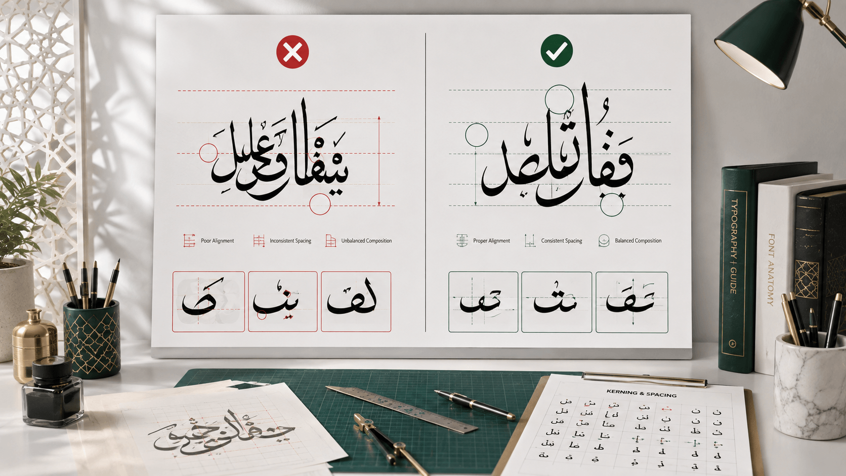
Leave safe margins around your calligraphy — Instagram's grid view and different aspect ratio crops (especially on older or non-square-preferring feed layouts) can clip content that sits too close to the edge of your canvas. A consistent margin, roughly 8-10% of the canvas dimension on each side, keeps your design intact across every place Instagram might display it.
Building a consistent template
If you're posting calligraphy regularly rather than as a one-off, build a repeatable template — same canvas size, same margin rules, same general color/background treatment — so your posts read as a recognizable series rather than one-off designs. This site's generator includes built-in social media size presets specifically so you can reuse the same layout logic across every new phrase without resetting dimensions each time. Save your preferred background and color settings as a starting point for each new post, and swap in new text and export — this consistency is what makes a calligraphy-focused account start to look like a considered brand rather than a scattered collection.
A note on hashtags and discoverability
Calligraphy-specific hashtags (in both English and Arabic, depending on your audience) meaningfully affect how your posts get discovered beyond your existing followers. Mixing broad tags (like general Islamic art or Arabic typography tags) with more specific ones (naming the calligraphy style you used, like Thuluth or Kufic) tends to reach both broad browsing audiences and people specifically searching for that style.
Frequently asked questions
What's the best Instagram post size for Arabic calligraphy specifically?
1080 x 1350px (portrait) generally gives calligraphy-heavy designs the most visual presence in the feed, though 1080 x 1080px square remains a safe, standard default if you want consistency with older or square-format posts.
Should I export Arabic calligraphy as PNG or SVG for Instagram?
PNG. Instagram requires raster images regardless of what format you design in, so SVG's scalability advantage doesn't apply here — export a high-resolution PNG at your target dimensions instead.
Why does my calligraphy look blurry after uploading to Instagram?
Instagram compresses every upload, so starting from a low-resolution or upscaled source makes that compression far more visible. Always export at full target resolution (1080px minimum on the shorter side) directly from your design tool rather than resizing a smaller image up.