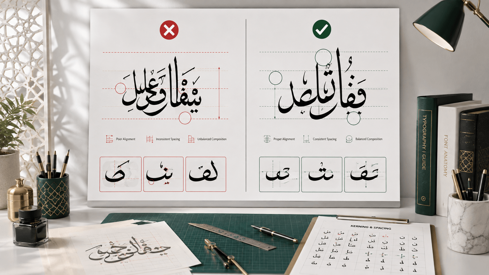
Most Arabic typography problems aren't about taste — they're technical errors that make text look subtly (or obviously) broken to anyone who reads Arabic, even if the design looks fine to someone who doesn't. Here are the seven mistakes that show up most often, and how to catch them before a design ships.
1. Broken letter connections
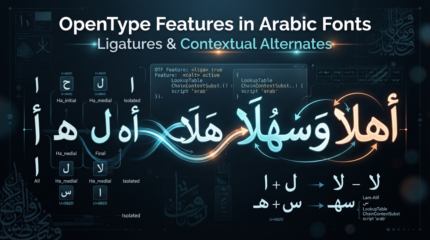
Arabic letters change shape depending on their position in a word — initial, medial, final, or isolated — and most of them connect to the letters next to them, similar to cursive handwriting. Software that doesn't handle Arabic script shaping correctly (older design tools, some image editors, certain PDF generators) can render each letter in its isolated form instead of connecting them, producing text that looks disjointed and immediately reads as wrong to a fluent speaker. Fix: always preview Arabic text in the actual tool or font you'll use for final output, not just in a plain text editor, and use software with proper Arabic text shaping support — a real Arabic-aware generator (like the one on this site) or a modern design tool with RTL/complex script support.
2. Getting the reading direction wrong
Arabic reads right-to-left, but the numbers embedded within Arabic text still read left-to-right, and mixing Arabic with Latin words or numbers in the same line can cause direction confusion if the software doesn't handle bidirectional text correctly. Signs of this bug: numbers appearing reversed, or Latin words embedded in Arabic sentences showing up in the wrong position. Fix: test any design that mixes scripts or numbers with real sample content, not placeholder text, since bidirectional bugs often only appear with the specific combination of characters you're actually using.
3. Using a "faux Arabic" novelty font
Some fonts are designed to visually evoke Arabic script for non-Arabic audiences — sometimes used in movie posters or logos aiming for a certain aesthetic — without being real Arabic typefaces at all. Applied to actual Arabic text, or mistaken for a genuine option, these produce garbled, unreadable results. Fix: only use verified Arabic typefaces. Every style on this site is a real, working Arabic font sourced from Google Fonts, not a decorative approximation.
4. Ignoring diacritics when they change meaning
Short vowels in Arabic are represented by diacritical marks (harakat) that are frequently omitted in everyday writing — newspapers, most websites, casual text — because context usually makes the intended word clear. But in specific cases (religious texts, poetry, disambiguating two words that share the same consonant skeleton but different vowels), omitting diacritics can create real ambiguity or even change meaning entirely. Fix: for Qur'anic or liturgical text specifically, keep the diacritics that are part of the standard text. For general design use, omitting them is a normal stylistic choice, not an error — just be intentional about which case you're in.
5. Applying letter-spacing (tracking) to Arabic text
Adding letter-spacing to Latin text is a common way to give headlines a more open, airy feel — applying the same technique to connected Arabic script breaks the letter connections entirely, since spacing pulls apart letters that are supposed to visually join. Fix: avoid tracking/letter-spacing adjustments on Arabic text altogether. If a design needs more visual breathing room, increase line spacing or the surrounding white space instead.
6. Mismatching style to context
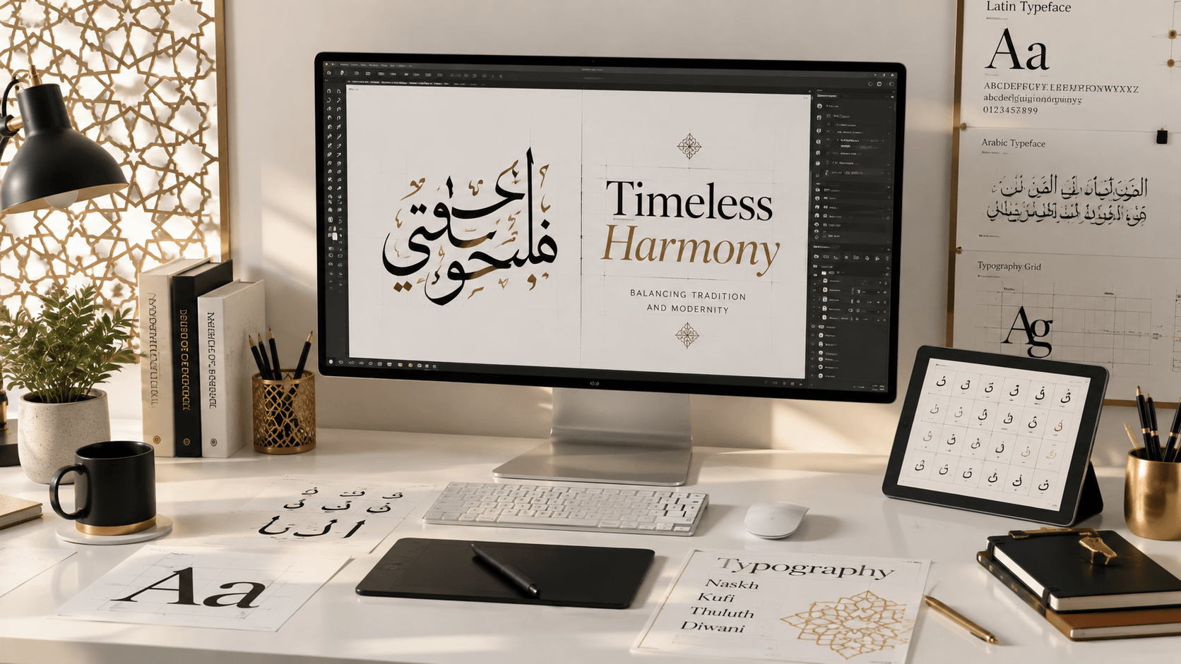
Using a highly ornamental style like Diwani or dense Thuluth for long-form body text makes it genuinely hard to read at length — these styles were historically reserved for titles and short ceremonial text precisely because they're slower to read. Conversely, using plain Naskh for a logo or single-word statement piece can look flat compared to what a more expressive style would achieve. Fix: match the style to the amount of text and its purpose — see our guide to choosing the right Arabic font for a fuller breakdown by use case.
7. Exporting at the wrong resolution or format
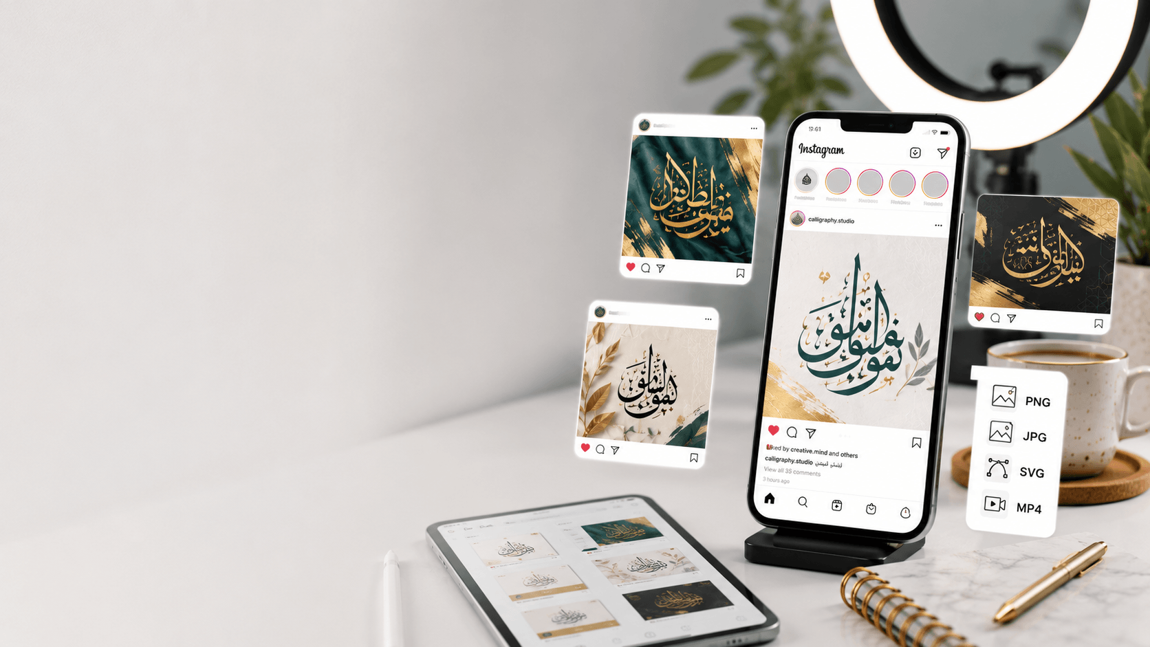
Arabic calligraphy's fine strokes and curves are especially sensitive to compression artifacts and low resolution — a blurry PNG makes ornamental styles look muddy in a way it might not for simpler Latin text. Fix: export SVG whenever the design might be resized, printed, or reused, and if PNG is required, export well above your target display size rather than at it. Our PNG vs SVG guide covers exact resolution guidance for print versus screen use.
The fastest way to catch these before they ship
Most of these mistakes are visible immediately if you preview your actual text, in your actual chosen font, at your actual intended size — the errors that slip through are almost always ones nobody actually looked at before exporting. Type your real text into the generator and check it at full size before finalizing anything, and if the piece is going anywhere permanent (print, engraving, a tattoo), have a fluent Arabic speaker review the final version too.
Frequently asked questions
Why does my Arabic text look disconnected or broken when I paste it into a design tool?
This usually means the software isn't applying proper Arabic script shaping — each letter is rendering in its isolated form instead of connecting to its neighbors. Use software with genuine Arabic/RTL support, or preview and export from a tool built for Arabic text specifically.
Is it ever okay to leave out diacritics (harakat) in Arabic design?
Yes — most everyday Arabic writing omits them, and it's a completely normal stylistic choice for general design use. The exception is religious or liturgical text, where the diacritics are typically considered part of the standard text.
Can I use letter-spacing on Arabic text the way I would on English headlines?
No — adding tracking to connected Arabic script breaks the letter connections and makes the text look wrong. Use line spacing or surrounding white space instead if you need to open up a design.