Color choices can make or break an otherwise well-chosen calligraphy style — a beautifully rendered Thuluth phrase in the wrong color combination can end up flat or hard to read, while the right pairing makes even a simple Naskh word feel intentional and finished. This guide covers the practical color and background decisions that matter most once you've already picked your text and style.
Contrast matters more with calligraphy than with plain text
Calligraphic letterforms — especially ornamental styles like Thuluth and Diwani — have fine strokes, tapering curves, and connected letters that rely on clear contrast against their background to read correctly. Low-contrast pairings (a mid-gray script on a slightly different mid-gray background, for instance) that would be merely subtle with a plain sans-serif font can make calligraphy nearly illegible, because the eye needs to trace the connections between letters, not just recognize a block shape. As a starting rule, keep at least a solid step of lightness difference between your text color and background — pure black or a deep color on white or a light neutral remains the most reliable combination for readability-focused pieces.
Solid colors: when simplicity wins
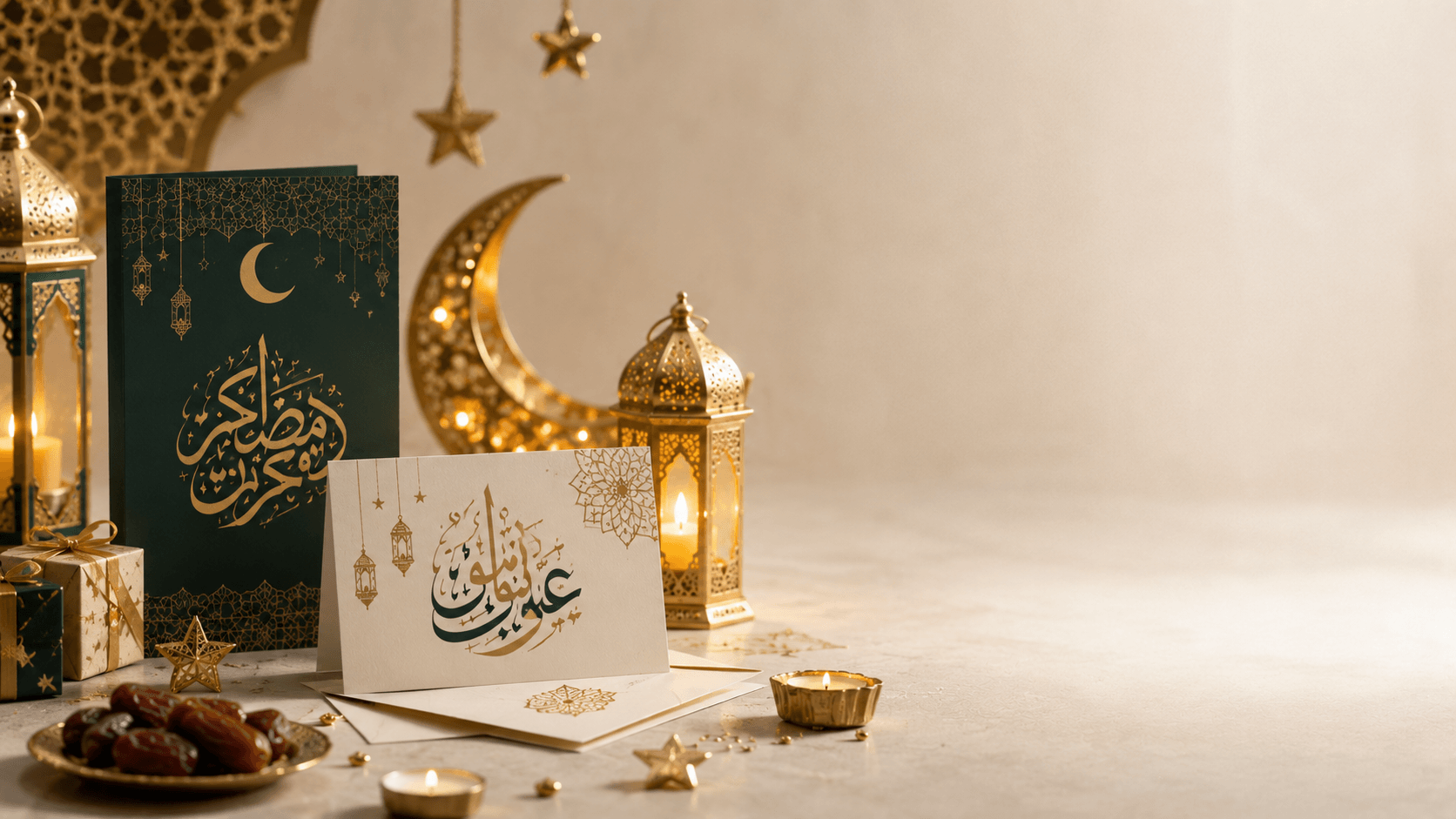
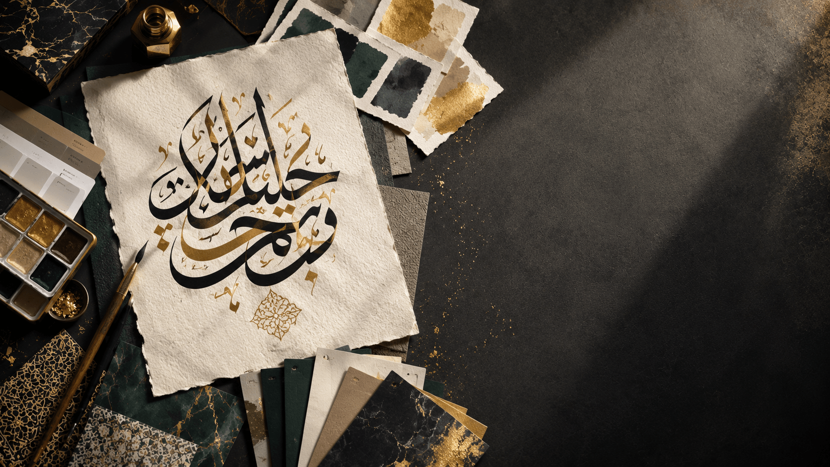
A single solid text color against a single solid background is the right default for most practical use cases — logos, signage, anything that needs to reproduce reliably across different printing methods or screen conditions. Deep teal, navy, burgundy, and black are traditional, versatile choices for formal or religious text, while brighter colors (gold, deep green, rich blue) work well for celebratory content like wedding invitations or Eid greetings. Gold or metallic-style colors specifically carry strong associations with ceremonial and religious Arabic calligraphy — used carefully, a gold or gold-gradient text color against a deep, dark background (navy, black, deep green) is one of the most reliable ways to make a piece feel premium without any additional ornamentation.
Gradients: use them on the text, not against it
A gradient applied to the calligraphy itself — text that shifts from gold to deep amber, or from one shade of blue to another — can add richness without sacrificing legibility, since the gradient shift is usually subtle enough not to interfere with letter recognition. Gradients used as a background need more caution: a background gradient that shifts too much in lightness across the design can leave your text well-contrasted on one side and nearly invisible on the other. If you use a background gradient, keep the lightness range narrow enough that your text color stays legible across the entire span, or angle the gradient so the text sits within its most contrasting zone.
Backgrounds: matching the piece's purpose
Transparent backgrounds are the most flexible choice if you're not sure yet where the final design will end up — they let you drop the calligraphy onto any surface, photo, or product mockup later without re-exporting.
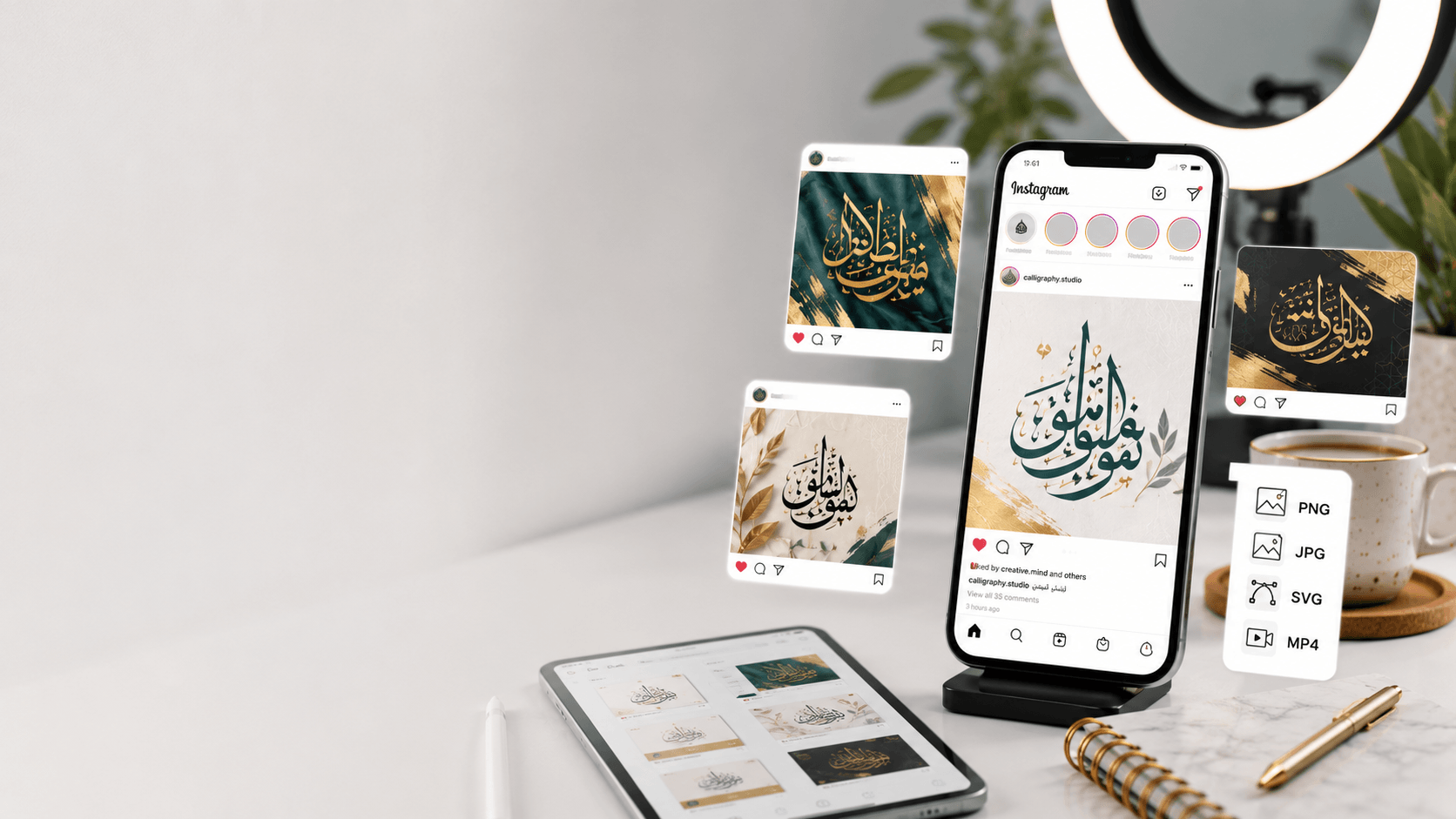
Solid color backgrounds work best for anything that needs to look finished and self-contained on its own — a social media post, a printed card, a standalone piece of wall art.
Image backgrounds — a textured paper look, a photo, a pattern — add atmosphere but require the most care with contrast, since photos rarely have uniform tone across their whole surface. If you use an image background, consider adding a subtle dark or light overlay behind the text zone specifically (many design tools, including this site's generator, support blur and opacity controls on background images for exactly this purpose) so the calligraphy stays readable regardless of what's happening in the photo underneath it.
Color choices by use case
For wedding invitations, warm metallics (gold, rose gold, copper) against cream, blush, or deep jewel-tone backgrounds are the most consistently popular pairing — see our wedding invitation guide for layout tips to go with the color choices here. For business branding, a single brand color used consistently across every calligraphic asset builds recognition faster than varying the color piece to piece. For Instagram and social posts, higher contrast and simpler backgrounds perform better in a fast-scrolling feed than subtle, low-contrast designs that need a second look to read.
Testing before you commit
Preview your design at actual size and, if possible, on the actual device or medium it's headed for — a color pairing that looks balanced on a large monitor can read completely differently on a phone screen or under gallery lighting if it's headed for print. Small adjustments to lightness and saturation often matter more than the specific hue chosen.
Frequently asked questions
What's the safest color combination for Arabic calligraphy if I'm not sure what to choose?
Dark text (black, deep navy, or deep teal) on a white or light neutral background is the most reliable, legible default across nearly every use case — printing, screens, and different lighting conditions all handle this combination predictably.
Is gold text a good choice for religious or Qur'anic calligraphy?
Gold is a traditional and popular choice for this kind of content, especially against a dark background like black, deep green, or navy — it reads as formal and ceremonial without extra ornamentation needed. Just make sure the specific gold shade you use still contrasts clearly enough to stay legible.
Should I use a background image or a solid color for a printed piece?
Solid colors are generally more reliable for print, since they reproduce consistently across different printers and paper types. If you do use an image background, test a physical print before ordering in bulk — screen colors and printed colors don't always match exactly.