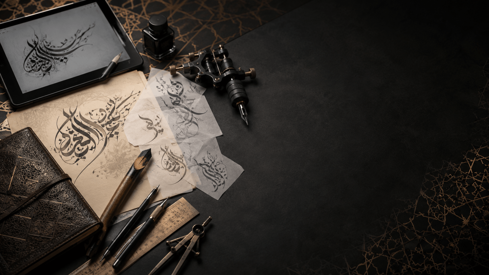
Arabic script is one of the most requested tattoo styles worldwide, and also one of the most frequently botched — a quick search for "Arabic tattoo fail" turns up plenty of permanent mistakes, from mirrored text to phrases that mean something entirely different from what the wearer intended. None of that is inevitable. A little care before you sit in the chair prevents almost all of it.
Verify the text before anything else
This is the step people skip, and it's the one that matters most. Arabic is written right-to-left, and its letters change shape depending on whether they're at the start, middle, or end of a word, or standalone — a font or app that doesn't handle this correctly can silently produce text that's technically wrong, even if it "looks like Arabic" to someone who doesn't read it.
Before finalizing anything, have a native or fluent Arabic speaker read your exact text back to you and confirm both the spelling and the meaning. This applies whether you're using a proverb, a name (see our guide to writing names in Arabic calligraphy), or a religious phrase — get a second opinion from someone who reads the script fluently, not just someone who recognizes that it "looks Arabic."
Choose a style that stays legible at tattoo size
Not every calligraphy style ages well on skin, and skin isn't paper — ink spreads slightly over time, fine details soften, and a design that looked crisp on screen can blur within a few years.
Naskh is the safest choice for tattoos. Its rounded, evenly weighted strokes and consistent spacing hold up well at small sizes and stay legible as the tattoo ages.
Thuluth works well for larger pieces — forearm bands, back pieces, anywhere there's room for its taller ascenders and more elaborate curves to actually read as intended rather than blur into a smudge.
Kufic can work for short words rendered as bold, simple geometric shapes, but avoid intricate Kufic variants with fine internal detail — those details are the first thing to blur.
Diwani and dense decorative styles are the riskiest choice for tattoos specifically because their appeal comes from tightly interwoven flourishes — exactly the kind of fine detail that doesn't survive skin's natural ink spread. If you love the look, consider a Thuluth-based alternative that captures a similar formal feeling with cleaner lines.
Get the file to your artist in the right format
Once your text and style are confirmed, export as SVG, not PNG. A tattoo stencil needs crisp, resizable line work — SVG's vector paths stay sharp at any size, while a PNG will show pixelation the moment your artist resizes it to fit the placement. Our PNG vs SVG guide covers this in more depth, but for tattoos specifically, SVG is not optional — it's the format that lets your artist trace the linework accurately.
Common mistakes to avoid
Getting the text mirrored or reversed is a surprisingly common error, since some tattoo transfer processes flip artwork by default — always confirm the final stencil reads correctly left-to-right in appearance even though Arabic reads right-to-left in composition (the letters themselves shouldn't be mirrored). Using a generic "Arabic-style" font that isn't a real Arabic typeface — sometimes sold as novelty fonts — can produce letterforms that don't correspond to real Arabic characters at all. Stick to genuine Arabic typefaces, like the real Google Fonts families used throughout this site, not decorative fonts that only approximate the look of Arabic script. Finally, skipping the native-speaker check because a translation app "seemed confident" is how most tattoo fails happen — translation and transliteration apps are a good starting point, not a final answer.
Placement and sizing considerations
Vertical placements (spine, forearm) suit Arabic's natural horizontal flow poorly unless the design is specifically composed for that orientation — work with your artist on layout before assuming a horizontal phrase will translate directly to a vertical band. Smaller placements (wrist, ankle, behind the ear) favor short words in Naskh over longer phrases in ornamental styles, simply because there's less room for detail to survive at small scale.
Frequently asked questions
Is it disrespectful to get a religious Arabic phrase as a tattoo?
Views vary by individual and by specific phrase — some religious phrases and verses are considered by many to be inappropriate for tattooing given differing religious perspectives on tattoos generally. If you're considering a religious or Qur'anic phrase, it's worth researching the specific phrase's context and, ideally, discussing it with someone knowledgeable in that tradition before proceeding.
How do I know if my translation app got the phrase right?
You generally don't, without a second check — translation apps are good at literal word-for-word conversion but often miss idiom, context, and grammatical gender agreement that a fluent speaker would catch instantly. Always verify with a person, not just an app.
What's the best Arabic calligraphy style for a small tattoo?
Naskh, consistently. Its clear, rounded, evenly spaced letterforms hold up best at small sizes and as the tattoo ages, compared to more ornamental styles that rely on fine detail to read correctly.