A restaurant menu has one job that overrides every other design instinct: get read correctly, fast, by someone who's hungry, probably sitting in low light, and not thinking about typography at all. That's a different brief than a wedding invitation or an Instagram graphic, and it's why the most "authentic-looking" Arabic menus are often the least usable ones — an ornamental script chosen because it looks traditional, set at a size and in lighting where almost nobody can actually read it. This site has covered weddings, tattoos, wall art, and Instagram graphics; a menu is a genuinely different use case, because it's the one format where legibility isn't a nice-to-have — it's the entire point.
What "authentic" actually means on a menu
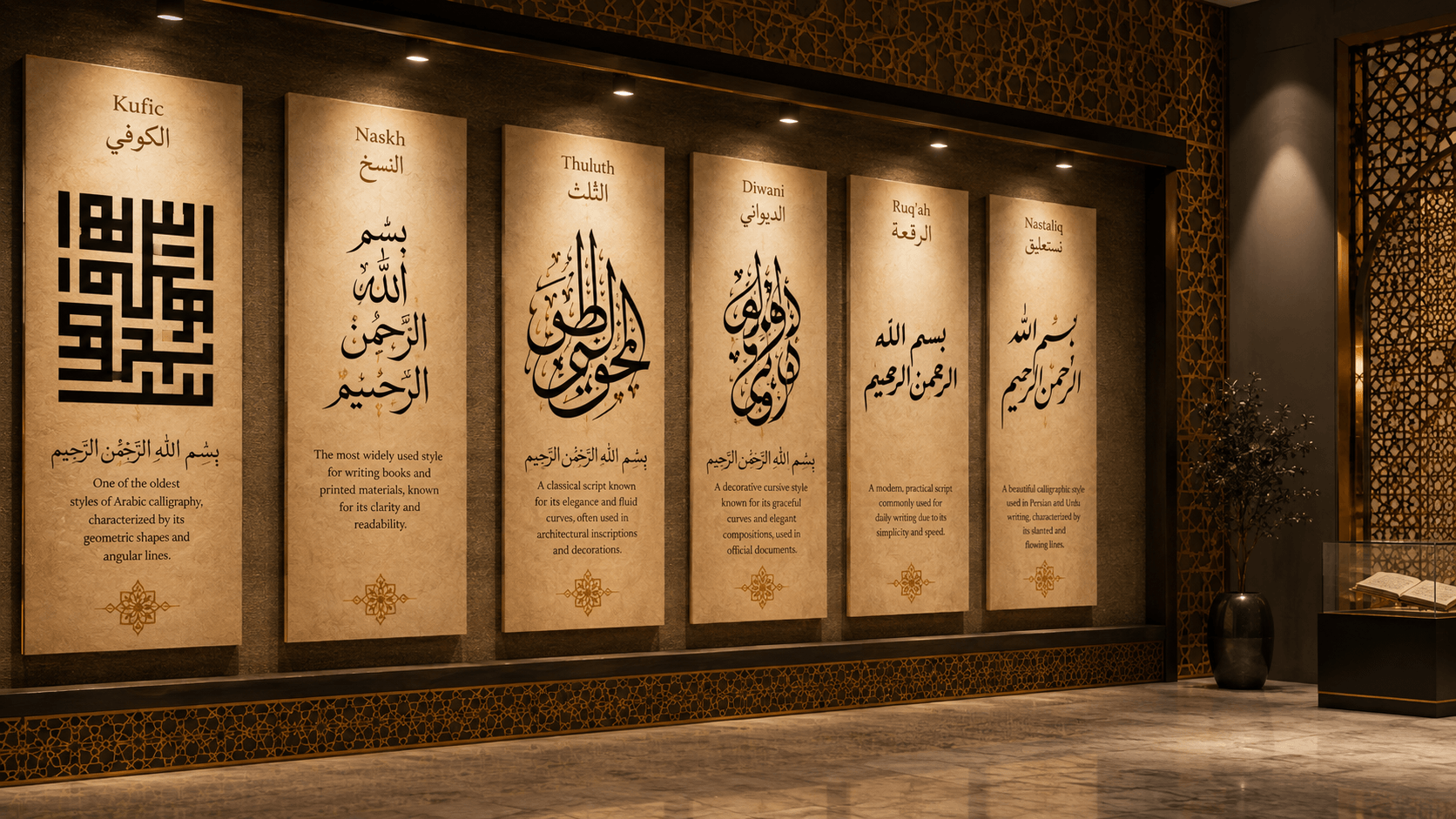
Highly ornamental scripts like Thuluth and Diwani earned their reputations doing a different job than a menu does. Thuluth is an elegant, heavily cursive script built around a defining rule — roughly one-third of each letter's stroke slopes at an angle — and it was historically used for Qur'anic chapter headings, monumental inscriptions, and mosque decoration: text meant to be looked at, not read quickly line after line. Diwani is even more decorative. It developed as an Ottoman chancery script prized for the deliberate complexity of its interwoven letters, and Britannica describes it as "as decorative as it was communicative" — meaning legibility was never the main design goal.
Neither of those is a flaw. It just means they were built for a different reading experience than a hungry customer scanning a menu for prices and dish names. Naskh, by contrast, developed specifically as a clear, functional cursive script for continuous everyday reading — it's the reason it became the dominant script for Qur'anic transcription from the 11th century onward, precisely because it prioritized legibility over ornament. "Authentic" doesn't have to mean "the most decorative script available." It means getting the real details right — correct dish names, real regional terminology, accurate diacritics where they matter — in a script that's actually doing its job.
Choosing a script for the job, not just the vibe
Split your menu into two typographic jobs and treat them differently. Body copy — dish names, descriptions, prices, ingredient lists — needs a script built for continuous small-size reading: Naskh or Ruq'ah are the right category here, since Ruq'ah in particular was standardized specifically as a fast, simple, everyday hand — clipped letters, short straight lines, simple curves, built for speed and clarity rather than flourish.
Your restaurant's name, section headers ("Appetizers," "Grills," "Desserts"), or cover treatment can carry more character, because they're short strings read once, not paragraphs read repeatedly. Thuluth signals heritage and formality well in that role; a more geometric Kufic treatment reads as more modern and minimal. Keep either one to a handful of words — never a full sentence, and never a price or ingredient list.
Bilingual Arabic/English layout
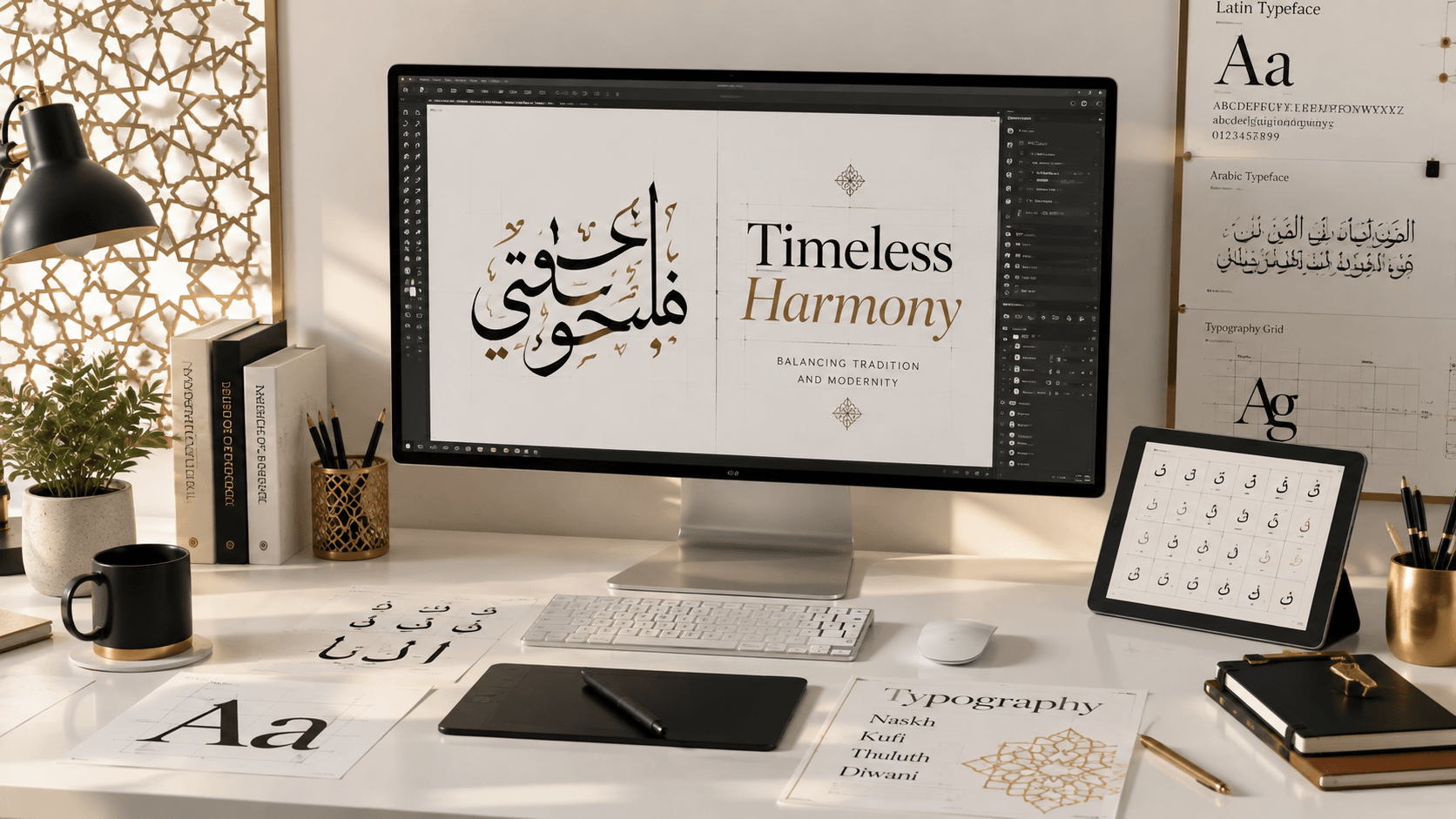
Most menus serving a mixed or international customer base need both languages, and that's a layout problem as much as a font-pairing one. Our guide to pairing Arabic and Latin fonts for bilingual typography covers weight and size balance between the two scripts; a menu adds a few format-specific wrinkles on top.
On a two-column bilingual layout, Arabic conventionally runs on the right side and English on the left, mirroring the overall right-to-left flow of the page. But don't mirror everything: prices and other numerals still run left to right within the line, even inside Arabic text, because — per W3C's Arabic and Persian layout requirements — "numbers, even Arabic numbers, are written from left to right, as is text in a script that is normally left-to-right." Flipping a price's digit order is one of the most common bilingual-menu production mistakes, and it's an easy one to catch if you know to look for it specifically.
Each language column also needs its own alignment logic rather than a forced match — Arabic text typically looks better right-aligned within its own column, English left-aligned within its own, rather than both centered to "look balanced," which tends to break the natural reading rhythm of both scripts at once.
Legibility requirements specific to restaurant environments
Restaurant lighting is usually warm, dim, and inconsistent — candlelit tables, low pendant lighting over a bar, evening service where the sun's gone down and the overheads are turned low for atmosphere. That environment reduces the contrast your eye can actually perceive, which means thin, light-weight calligraphic strokes and low-contrast color pairings (gold ink on cream stock, pale gray on white) are exactly the wrong choice for body copy, even if they look elegant on a bright screen while you're designing.
Physical size matters just as much. Menu descriptions are often set small to fit a printed page, and Arabic's connected letterforms and stacked diacritics need slightly more line spacing than Latin text at an equivalent size, or ascending and descending marks from adjacent lines start to visually collide. The same W3C document notes that intra-word spacing in Arabic is limited to the gaps between non-joining letters — connected letters can't be pulled apart the way Latin letterspacing allows — which caps how much you can safely condense a line before it starts optically reading as a solid, connected mass rather than distinct words.
Glossy or heavily laminated menu surfaces compound the problem under directional restaurant lighting, since they throw glare exactly where a customer is trying to read prices.
Paper, ink, and color choices for print
As a general rule, dark text on a light background holds up better under low, inconsistent ambient light than the reverse, because thin reversed-out strokes — light text on a dark ground — are the first thing to lose definition when contrast or lighting drops. If a dark or richly colored background is important to your brand identity, reserve it for the cover or section headers, and keep the working copy — dish names and prices customers actually need to read quickly — on a higher-contrast panel.
Matte or lightly textured stock generally reduces glare compared to high-gloss lamination under the kind of directional lighting most restaurants use. And if you're using geometric or arabesque border motifs for atmosphere, keep them framing the text block rather than sitting behind it — the same principle that applies to combining calligraphy with geometric pattern anywhere else. Pattern behind small, actively-read text is the single most common way an otherwise good-looking menu becomes genuinely hard to use.
A practical checklist before you print
- Body copy set in Naskh or Ruq'ah, tested at actual print size under dim lighting, not just on a bright monitor
- Ornamental or display scripts reserved for the restaurant name and section headers only
- Bilingual columns each following their own alignment logic, not forced to match
- Price numerals confirmed left-to-right, even within right-to-left Arabic lines
- Matte or textured stock favored over high-gloss lamination where possible
- Decorative patterns or motifs framing the text block, never sitting directly behind live copy
Bringing it together
Prototype your restaurant's name and section headers in the Arabic calligraphy generator before committing to a print layout — it's the fastest way to compare how a phrase actually looks across Naskh, Ruq'ah, Thuluth, and Kufic side by side, at real sizes, before a single page goes to a printer.
Frequently asked questions
What's the best Arabic script for a restaurant menu's body text?
Naskh or Ruq'ah are the best choices for dish names, descriptions, and prices, since both were developed specifically for clear, fast reading at small sizes. Save more ornamental scripts like Thuluth for the restaurant's name or section headers, where they're read once rather than scanned repeatedly.
Should the Arabic or English column come first on a bilingual menu?
Arabic conventionally sits on the right and English on the left, following the overall right-to-left reading direction of the Arabic text. Numerals like prices still read left to right within the line even inside Arabic text, so don't reverse the digit order when laying out a bilingual price column.
Why does heavy ornamental Arabic script hurt a menu's readability?
Scripts like Thuluth and Diwani were historically built for ceremonial or decorative reading — headings, inscriptions, titles — not for continuous small-size text scanned quickly under dim restaurant lighting. Their intricate strokes and tight letter spacing that look elegant at large display sizes become hard to parse once they're shrunk down to menu-description size.