Bilingual Arabic-Latin design shows up everywhere — packaging, business cards, signage, app interfaces — and it's harder to get right than pairing two Latin typefaces, because Arabic and Latin scripts don't share the same visual logic. They run in opposite directions, their letters carry weight differently, and a "matching" font size in points can look wildly mismatched once actually set side by side. This guide covers the practical rules that make bilingual pairings look deliberate instead of accidental.
Why Arabic and Latin type don't "match" by default
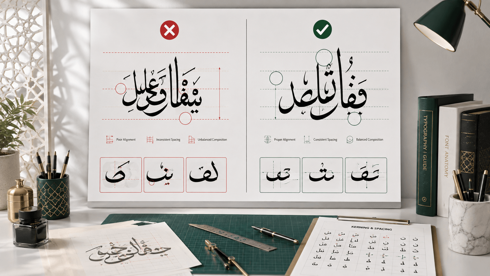
Arabic script has no concept of uppercase or lowercase, connects almost all of its letters within a word, and relies heavily on curves even in its more geometric styles like Kufic. Latin type, by contrast, is built on a mix of straight lines and controlled curves with a strong horizontal baseline. Set two typefaces with the same point size next to each other and the Arabic will often look visually smaller or lighter, because Arabic letterforms typically occupy less of their character box vertically than Latin capitals do. This isn't a flaw in either script — it's just a difference designers need to actively compensate for rather than assume will resolve itself.
Matching weight, not just size
Instead of matching point sizes directly, match visual weight — how heavy or light the strokes look at a glance. A Latin typeface's "Bold" weight often needs to be paired with an Arabic font one step heavier than its nominal "Bold" to read as equally weighted, since Arabic bold weights frequently add less visual mass per character than their Latin counterparts do. The only reliable way to check this is to set both scripts side by side at your actual intended size and look at them, rather than trusting that identical weight labels ("Bold," "Semibold") will produce a visual match across two different type families.
Choosing compatible styles
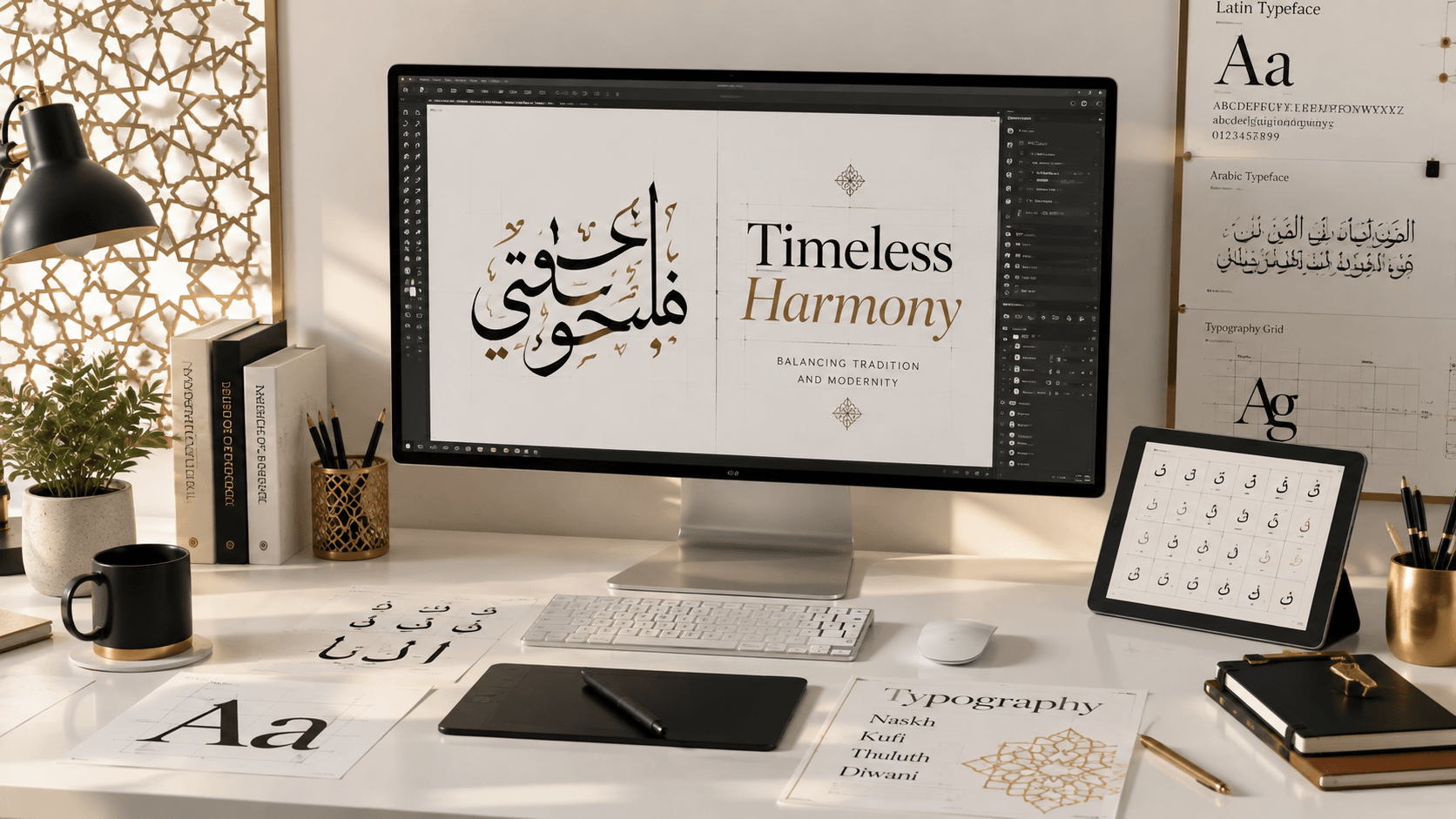
Pair readable with readable, and decorative with decorative — a highly legible sans-serif Latin font paired with an ornamental Diwani-style Arabic font will fight itself, since one side of the pairing signals "read me easily" and the other signals "admire me slowly." For body text and UI copy, pair a clean Latin sans-serif with a Naskh-based or Modern/Digital Arabic font (Cairo, Tajawal, and similar families are built specifically for this kind of UI pairing). For a logo or headline treatment where both scripts need to carry equal visual drama, pair a Latin serif or display font with Thuluth or Kufic — both sides can be ornamental together without one undermining the other.
Layout and direction
Arabic reads right-to-left; Latin reads left-to-right. When both appear in the same layout, there are two common approaches: fully mirrored layouts, where the entire composition flips (logo or key visual on the right, text flowing right-to-left) for Arabic-primary audiences, or a stacked/split layout, where each language gets its own clearly separated zone (Arabic on top or right, Latin below or left) rather than trying to interleave them on the same line. Interleaving Arabic and Latin words within a single line of text is the riskiest approach and should generally be avoided in design work — it's necessary in running bilingual sentences, but for headlines and branding, separation reads more cleanly.
Testing your pairing
Before finalizing a bilingual design, test it at the actual size it will be used — a pairing that looks balanced at a large preview size can fall apart at business-card scale if one script's fine details disappear before the other's does. Our generator lets you preview Arabic type at your exact intended size and color, which makes it easier to judge the pairing against your chosen Latin typeface set at the same scale in your design tool.
Frequently asked questions
Should Arabic and Latin text be the same font size in a bilingual design?
Not necessarily the same point size — match visual weight and apparent size instead, since Arabic and Latin letterforms occupy their character boxes differently. Set both side by side at your intended scale and adjust by eye rather than relying on matching numbers.
Can I use a decorative Arabic font with a plain Latin font?
You can, but it usually reads as unbalanced — pair legibility with legibility and ornamentation with ornamentation. If you want contrast between the two languages, it's safer to vary color or size than to mismatch how ornate each script is.
What's the safest Arabic font family for pairing with Latin text in a user interface?
Modern/Digital families built for screens — Cairo, Tajawal, IBM Plex Sans Arabic, and similar — are designed specifically to sit comfortably alongside Latin UI fonts, since they share similar stroke weights and x-heights across multiple font weights.