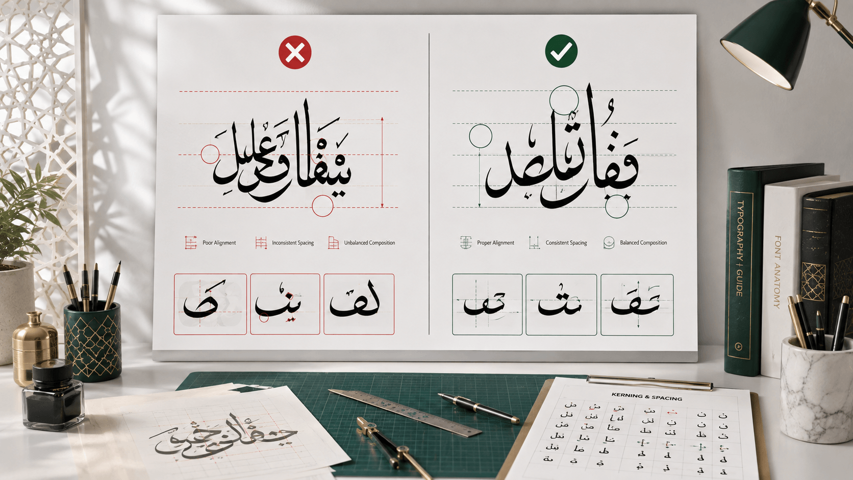
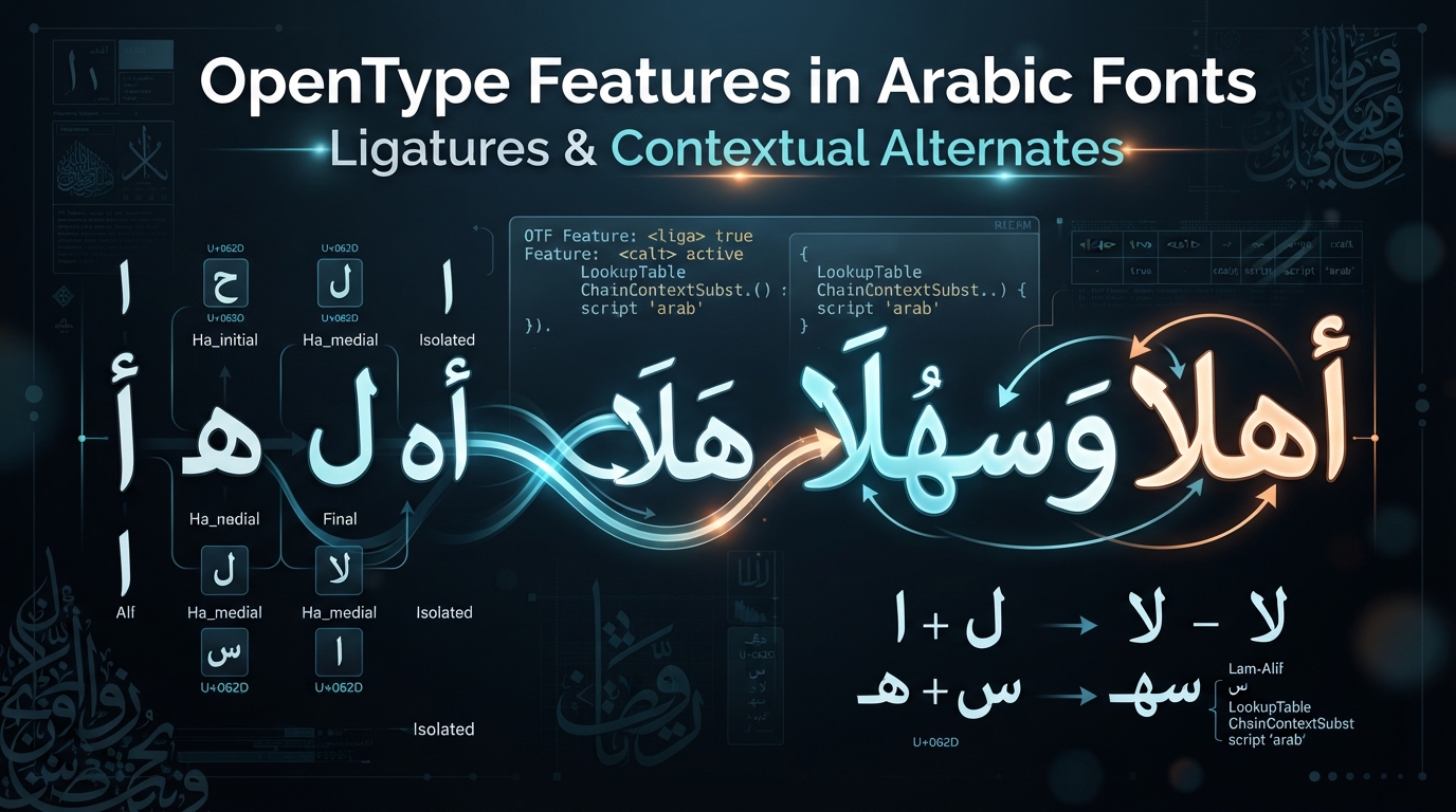
The site's guide to common Arabic typography mistakes opens with the most visible one: broken letter connections, where Arabic text renders as a row of disconnected shapes instead of a flowing, joined word. That post tells you how to catch it. This one explains the actual mechanism underneath it — what's happening at the font-and-rendering level that makes Arabic text join correctly at all, and why it sometimes doesn't.
Why one Arabic letter needs up to four different shapes
Arabic is a cursive script by design, not by styling choice — most letters physically connect to the letters next to them within a word, the way joined handwriting does. Unicode encodes this efficiently: there's exactly one code point for the letter ب (bāʾ), regardless of where it sits in a word. But visually, that single letter can appear in up to four distinct shapes — isolated (standalone, joined to nothing), initial (joined only to what follows), medial (joined on both sides), and final (joined only to what precedes) — depending entirely on its neighbors.
Unicode formalizes which letters can join at all through a character property called Joining_Type: letters are classified as dual-joining (can connect on both sides, so they have all four forms), right-joining, left-joining, or non-joining. A single code point carrying multiple possible visual forms means the rendering software has to do real work to pick the right one — it can't just look up a glyph and draw it. That work is called text shaping, and it happens in a shaping engine (HarfBuzz on Linux and in Chrome, DirectWrite/Uniscribe on Windows, Core Text on macOS/iOS) that sits between the raw text and the font.
The OpenType features that actually pick the shape
The mechanism the shaping engine relies on is a set of standardized OpenType layout features, each identified by a four-letter tag, that tell a font which alternate glyph to substitute in a given context. For Arabic joining specifically, the relevant tags are:
isol— Isolated Forms: substitutes the glyph used when a character isn't joined to anything.init— Initial Forms: substitutes the glyph used when a character starts a connected sequence.medi— Medial Forms: substitutes the glyph used when a character is joined on both sides.fina— Final Forms: substitutes the glyph used when a character ends a connected sequence.
Microsoft's OpenType feature registry defines each precisely — fina, for instance, "replaces glyphs for characters that have applicable joining properties with an alternate form when occurring in a final context," while the registry's entry for medi specifies it applies specifically to characters with the dual-joining property, since only a letter capable of joining on both sides can ever need a true medial form. Mechanically, each of these is stored in the font as a GSUB (glyph substitution) lookup: a table mapping a character's default glyph ID to the correct positional glyph ID. The shaping engine analyzes a run of text, determines each character's joining context from its neighbors, and then queries the font: "for this character, in this position, which feature applies, and what glyph does it map to?" If the font has a properly built lookup for that feature, the correct joined glyph gets substituted in.
According to Microsoft's Arabic script shaping documentation, these features are applied by the shaping engine in a strict order — character composition first, then the positional forms (isol, fina, medi, init), then required ligatures, then contextual alternates. That ordering matters because later steps depend on the positional analysis done earlier. When any part of that pipeline is missing — an app or rendering environment without a real Arabic shaping engine, a font exported without its positional-form lookups intact, or text rendered through a code path that treats Arabic as if it were a simple one-glyph-per-character script like English — the result is exactly what mistake #1 describes: every letter falls back to its isolated form, and a connected word turns into a row of separate, unjoined shapes.
Ligatures: when two letters become one glyph
Positional shaping swaps one letter for a different-looking version of itself. Ligatures are a separate mechanism: substituting multiple letters for a single, purpose-built joined glyph. The clearest example in Arabic is lām-alif — the sequence lām (ل) followed by alif (ا). Rather than rendering as two separate joined letterforms, Arabic script has always written this combination as one distinct compound shape, and digital fonts reproduce that with a ligature substitution (GSUB lookup type 4: many glyphs in, one glyph out).
What makes lām-alif specifically interesting from a technical standpoint is which OpenType feature is responsible for it. Microsoft's documentation identifies it as a required ligature, implemented through the rlig (Required Ligatures) feature rather than the more familiar liga (Standard Ligatures) feature. The distinction matters: liga covers optional typographic refinements that a designer recommends but that users or applications can choose to disable (the way software might let you turn off "fi" and "fl" ligatures in a Latin font). rlig, by contrast, is meant to always be applied by any script-aware shaping engine, with no user-facing toggle, because without it the text is not just less elegant — it's rendered incorrectly for the script. Microsoft's own registry description is direct about it: font developers "should use this table for all ligatures that they want to map as such all of the time," specifically distinguishing it from ligatures "that should be optional, based on user preferences," which belong in liga instead.
That's why lām-alif is a useful test case for whether a font — or the software displaying it — actually supports Arabic properly. It's not a stylistic nicety a font can skip; it's baseline required shaping, the same category of feature as the positional forms covered above.
There's a practical reason rlig exists as a separate, non-optional feature rather than folding lām-alif into liga: Microsoft's registry also flags a backward-compatibility case, noting that fonts targeting older Windows-level support "will also want to include the items in the rlig feature in the liga feature" as well, so that even a rendering path that only checks standard ligatures still produces the correct joined shape. That's a small detail, but it's a useful reminder that Arabic shaping support isn't one feature you either have or don't — it's a layered set of substitutions, and a font or renderer can implement some of them correctly while still missing others.
What this means when you're choosing or troubleshooting a font
The practical takeaway is that broken connections and a stubbornly unligated lām-alif usually aren't font problems in the sense of "this font is broken." More often, they're environment problems: the software rendering the text — an older image editor, a PDF export path, a canvas or SVG text renderer that doesn't route Arabic through a real shaping engine — isn't applying init/medi/fina/isol and rlig at all, so it doesn't matter how correctly the font's own lookups were built.
The fix, as a font shopper or developer, is to stop judging Arabic type support by font name or category and actually test it: type real connected words, including at least one lām-alif combination, in the specific environment you'll ship in — not just in a font-preview tool that's known to shape correctly. The site's font generator applies proper shaping by default, which makes it a reasonable sanity check for whether a rendering problem is coming from the font itself or from wherever else you're trying to display it. If you're building the display layer yourself rather than just choosing a font, this connects directly to the mechanics covered in the RTL web development guide — text shaping and bidirectional layout are two separate systems that both have to work correctly for Arabic to render the way it's supposed to. And if you're comparing fonts for a specific project, the site's roundup of free Google Fonts for Arabic calligraphy is a good next stop — every option there ships with proper Arabic shaping support built in.
Frequently asked questions
Why does Arabic text sometimes show up as disconnected letters online?
It usually means the rendering environment isn't applying the OpenType init, medi, fina, and isol substitutions that pick the correct joined glyph for each letter's position. This is most often a software or shaping-engine problem, not a defect in the font itself.
What's the difference between a ligature and a contextual (positional) form?
A contextual form is the same letter rendered as a different shape depending on where it sits in a word, a one-to-one glyph swap handled by features like init, medi, and fina. A ligature replaces multiple letters with a single combined glyph, a many-to-one substitution, which is how the lam-alif combination is rendered.
Is the lam-alif ligature optional in a font?
No. It's classified as a required ligature and implemented through OpenType's rlig feature, which a properly built Arabic shaping engine applies automatically with no user-facing toggle, unlike optional ligatures handled through the liga feature.
How can I check whether a font actually supports Arabic shaping before using it?
Type real connected Arabic words, including a lam-alif combination, directly in the environment you plan to use, rather than trusting the font's name or category. The site's Arabic calligraphy generator applies proper shaping by default and is a quick way to isolate whether a rendering issue is coming from the font or from elsewhere in your pipeline.