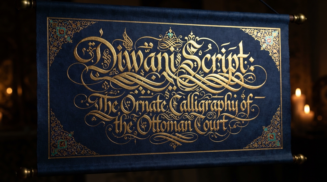
Most official documents are designed to be as clear as possible. Ottoman chancery scribes built a script that did the opposite on purpose — and that was the point. Diwani is one of the most visually striking Arabic calligraphy styles, all compressed curves and interlocking strokes, and it wasn't developed as decoration first. It was developed as a functional tool of state power, and its near-illegibility to outsiders was a feature, not a flaw.
A script born in the Ottoman chancery
Diwani takes its name from the diwan — the Ottoman government council or chancery — and developed there during the reign of the early Ottoman sultans, roughly the 16th through early 17th centuries, according to Encyclopaedia Britannica's entry on the script. It reached its peak of prominence and refinement under Suleiman I "the Magnificent" (1520–1566), the same era that produced the Ottoman Empire's most elaborate imperial documents.
Sources differ on exactly who first shaped Diwani into a formal chancery hand — the Library of Congress's overview of Ottoman calligraphy sheets notes that the style drew inspiration from Persian ta'liq script and was later refined by the renowned Ottoman calligrapher Şeyh Hamdullah. What's not in dispute is its function: Diwani was, in the words of the Wikipedia entry on the script, treated as "one of the secrets of the sultan's palace," its use restricted to a small circle of trained court scribes rather than taught broadly the way naskh or thuluth were.
That restriction is worth sitting with, because it's the opposite approach from most of the scripts covered elsewhere on this site. Kufic was carved into public monuments precisely so ordinary people could see it. Naskh was taught broadly because everyday commerce and religious study depended on it being legible to as many literate people as possible. Diwani inverted that logic entirely: it was cultivated inside the palace bureaucracy specifically so that fewer people could read or write it, turning scarcity of skill into a form of institutional security.
Complexity as a security feature
Here's the detail that makes Diwani's history genuinely unusual among Arabic scripts: its difficulty was deliberate, and it served a real administrative purpose. Diwani's letters are compressed, ambiguously joined, and often written without the dots that normally disambiguate similar Arabic letterforms. Reading it fluently requires real training. That made it very hard to forge.
The Library of Congress puts it plainly: Diwani was "somewhat difficult to read, let alone forge," which made it "perfect for official and confidential documents." Sultans used Diwani script — often paired with the sultan's calligraphic signature, or tughra — to write imperial decrees known as firmans, along with land grants, endowment deeds, and formal resolutions. A document written in authentic court Diwani, accompanied by a genuine tughra, carried the unmistakable authority of the Ottoman state precisely because so few people outside the palace could reliably reproduce it. It functioned less like a typeface and more like a watermark: proof of origin baked directly into the handwriting itself.
Diwani vs. Diwani Jali
Calligraphy instruction today generally splits the style into two related forms. Plain Diwani (sometimes called riq'a diwani) keeps its letters relatively restrained: tightly joined, curved, but with mostly straight baselines except at the base of certain letters. It's the more "readable" end of the style, still used for correspondence and ceremonial writing.
Diwani Jali (also written jeli diwani) is the ornate cousin most people picture when they hear the name. It takes the same interlocking letterforms and adds dense decorative marks — small dots, hooks, and filler strokes — packed into the negative space around and between letters. The Library of Congress attributes the development of this more decorative variant to the calligrapher Hafiz 'Uthman. Those fillers aren't random flourishes; historically, a calligrapher placed them to balance the composition of a specific piece, filling whatever gaps happened to occur once the main text was laid out, so that the finished page reads as a single dense, ornamental unit rather than a line of separate words.
Why digital Diwani fonts remain genuinely rare
That last detail — decoration placed to fill whatever space is actually available in a specific composition — is also the best explanation for why authentic, full-featured digital Diwani fonts are still uncommon, even as naskh, kufi, and thuluth are all comfortably represented across major font libraries.
Most digital Arabic fonts work by mapping each letter to a fixed glyph, or a small, predictable set of contextual glyphs (initial, medial, final, isolated forms), and letting OpenType shaping rules join them automatically. Diwani resists that model at a structural level. Type designer Kristyan Sarkis, writing about building the Diwani-based Thuraya typeface for the Arabic type foundry TPTQ Arabic, describes the script's defining trait as its slanted baseline — letters don't sit on a straight line the way naskh or kufic do, they cascade diagonally, and the connections between them shift depending on what comes before and after. Getting that to work as a font, rather than a single hand-drawn composition, required building roughly 660 ligature combinations plus a custom OpenType cursive-attachment system using positioning anchors just to keep the flow believable. Sarkis also notes that early attempts to mechanically force the typeface to follow calligraphic proportions produced unsatisfying results — the geometry that looks right when a human calligrapher improvises it doesn't automatically translate into a clean, reusable digital glyph set.
In other words, the same quality that made Diwani good at resisting forgery in the 16th century — its dependence on a trained hand making real-time judgment calls about spacing, connection, and ornament — is exactly what makes it hard to compress into the fixed, rule-based glyph sets that digital fonts require. A calligrapher improvising Jali fillers to balance one specific page is doing something genuinely different from a font engine applying the same substitution rule every time a certain letter pair appears. That's a large part of why this site's own collection, like most Arabic font libraries, includes far more naskh, kufi, and thuluth options than genuine Diwani ones — the handful that exist typically simplify the script's most calligrapher-dependent flourishes to make it function reliably at any size or in any word.
Where Diwani still shows up today
Diwani hasn't disappeared from real use. It remains a common choice for high-prestige, ceremonial writing — presidential and royal correspondence, formal certificates, wedding invitations, and decorative art pieces where a human calligrapher, not a font, is doing the actual lettering. Contemporary calligraphers still commission large-scale Diwani and Diwani Jali work for murals and public art, precisely the kind of one-off composition where a trained hand can keep adjusting spacing and ornament to fit the wall, rather than reusing the same fixed glyph over and over the way a font has to.
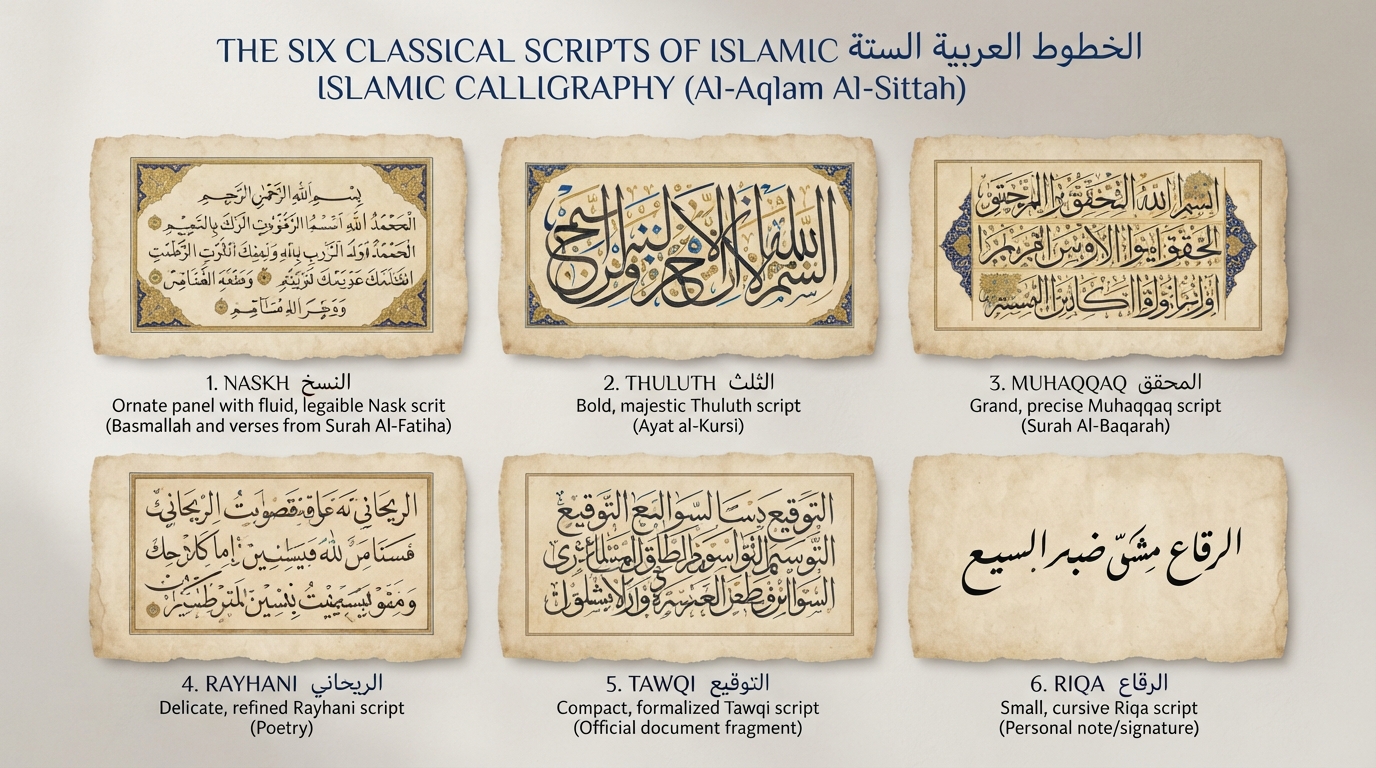
That's also a useful thing to know if you're shopping for a "Diwani" font online: plenty of decorative typefaces borrow the name and the general silhouette — heavy curves, tight joins — without attempting the full calligraphic rule set, because a true one-to-one digital translation of hand-drawn Diwani is genuinely hard to produce at scale. If you're designing something that calls for that ornate, official feel digitally, it's worth previewing how the closest available styles actually render using the font generator, and reading through this site's broader guide to Arabic calligraphy styles to understand which script fits a given project instead of defaulting to whichever one looks the most ornamental. For more on the six classical scripts Diwani sits alongside historically, see this site's piece on the six classical scripts of Islamic calligraphy.
Frequently asked questions
What is Diwani script?
Diwani is an ornate, highly cursive Arabic calligraphy style developed in the Ottoman chancery (diwan) starting in the 16th century. Its letters are tightly compressed and joined in ways that make it distinctive and difficult to read without training.
Why was Diwani used for official Ottoman documents?
Its complexity made it hard to forge. Because reading and reproducing Diwani required specialized training available mainly to court scribes, it was used for imperial decrees (firmans), land grants, and endowments, functioning as a built-in authenticity marker for Ottoman state documents.
What is the difference between Diwani and Diwani Jali?
Plain Diwani is the more restrained form, with tightly joined letters and mostly straight baselines. Diwani Jali (jeli diwani) is a more ornamental variant that fills the space around and between letters with decorative dots, hooks, and filler marks, historically credited to the calligrapher Hafiz 'Uthman.
Why are there so few digital Diwani fonts compared to Naskh or Kufi?
Diwani's defining features — a slanted baseline, context-dependent letter connections, and hand-placed decorative fillers — don't map cleanly onto the fixed glyph sets and predictable substitution rules that digital fonts rely on. Type designers who have built Diwani fonts report needing hundreds of custom ligatures and specialized OpenType positioning just to approximate the effect.
Is Diwani script still used today?
Yes, though mostly for ceremonial and prestige purposes rather than everyday text — presidential and royal correspondence, formal certificates, decorative art, and invitations, typically produced by trained calligraphers rather than typed in a Diwani font.