Long before Kufic became a popular choice for modern logos and headings, it was carved into stone, cast in metal, and woven into tile — the script that gave Islamic architecture some of its most recognizable visual texture. This is a closer look at how Kufic developed specifically as an architectural and monumental script, distinct from its later role as a decorative digital font.
Origins in early Qur'anic manuscripts
Kufic takes its name from Kufa, an early center of Islamic scholarship in present-day Iraq, and is among the oldest formalized Arabic calligraphy styles, predating Naskh by centuries. Early Kufic manuscripts, some of the oldest surviving Qur'an copies, show the script's defining characteristics already in place: thick, angular strokes, minimal curvature, and letters built from straight lines meeting at deliberate angles rather than the flowing connections found in later cursive styles. This geometric quality wasn't a stylistic accident — it reflected the writing tools and surfaces available at the time, and it happened to produce a script that translated exceptionally well into other media beyond ink on parchment.
From page to monument
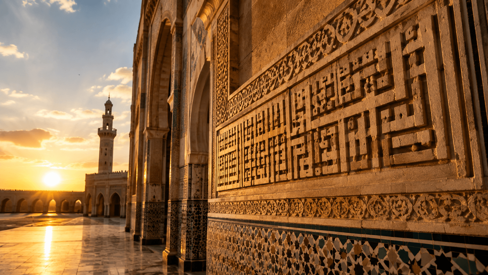
Kufic's angular structure made it unusually well suited to carving, a fact architects and craftsmen exploited extensively from the early centuries of Islamic architecture onward. Monumental Kufic inscriptions appear on some of the most significant early Islamic buildings, including the Dome of the Rock in Jerusalem, where a lengthy Kufic inscription runs around the building's interior. The script's straight lines and consistent angles made it far more practical to render accurately in stone, brick, and tile than a cursive script's flowing curves would have been — a purely practical advantage that also happened to produce a strikingly bold, legible visual result at monumental scale.
Regional variations
As Kufic spread across the expanding Islamic world, regional traditions developed distinct variations. Square Kufic (also called banna'i or brick Kufic) organizes letterforms onto a strict grid, allowing the script to be built directly from patterned brickwork or tilework — visible extensively across Central Asian and Persian architecture, where entire inscriptions were constructed as geometric tile patterns rather than carved or painted. Foliated Kufic incorporates decorative vegetal elements woven through and around the letterforms, softening the script's original austerity with organic ornamentation, common in North African and Andalusian architectural contexts. Eastern Kufic, developed later in Persian-influenced regions, introduced more elongated, elegant proportions compared to the earlier, more rigid Kufic of the Qur'anic manuscript tradition.
Kufic on coins and seals
Beyond architecture, Kufic became the standard script for early Islamic coinage — its clarity and consistency at small scale made it practical for minting, and Kufic-inscribed coins from the early Islamic period remain an important source for historians tracing the movement of trade and political authority across regions and centuries. The same properties that made it work at monumental architectural scale — bold, consistent strokes, high legibility even when worn or reproduced imprecisely — made it equally effective at coin scale.
Why Kufic still works as a modern design choice
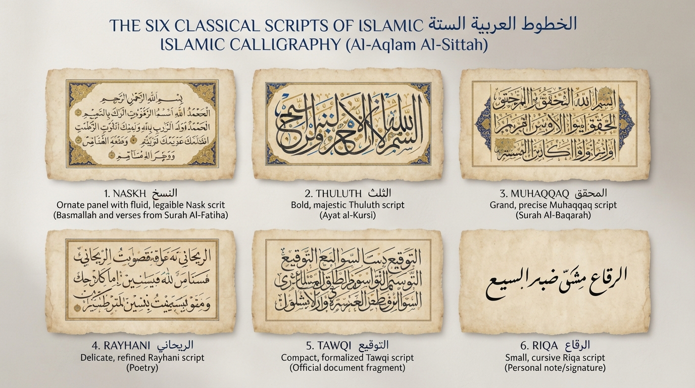
The same structural qualities that made Kufic effective on 9th-century mosque walls are exactly what make it effective in a 21st-century logo: strong geometric consistency, high legibility at both large and small sizes, and a visual boldness that reads clearly even to viewers who don't read Arabic. Modern webfonts like Reem Kufi and Noto Kufi Arabic are direct typographic descendants of this architectural tradition, simplified and standardized for screen use but carrying the same fundamental letterform logic that made Kufic endure for over a thousand years. See our full breakdown of Arabic calligraphy styles for how Kufic compares to Naskh, Thuluth, and the other major traditions, or preview Kufic fonts directly on our Kufi style page.
Frequently asked questions
What's the difference between Kufic and Square Kufic?
Standard Kufic is the original angular script developed for early manuscripts and general architectural use. Square Kufic (banna'i) is a specific later variant built strictly onto a grid, designed for construction directly from patterned brick or tilework rather than freehand carving or painting.
Why was Kufic used so often in early Islamic architecture specifically?
Its straight lines and consistent angles were far easier to carve accurately in stone, brick, and tile than a flowing cursive script would have been, while also producing bold, highly legible results at large architectural scale.
Is modern Kufic used in logos related to the historical architectural script?
Yes — contemporary Kufic webfonts are direct typographic descendants of the same tradition, simplified for digital use but retaining the geometric structure and strong legibility that made historical Kufic effective on monuments and coins alike.