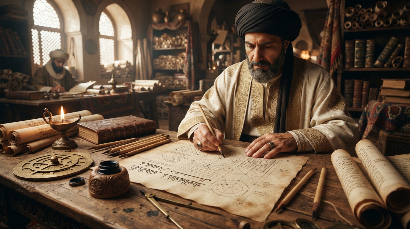
Most calligraphic traditions evolve the slow way — generations of scribes nudging letterforms toward whatever is fastest to write, with no single person steering the result. Arabic script had a rare exception. In early tenth-century Baghdad, a career political operator who also happened to be a first-rate calligrapher sat down and tried to derive the "correct" shape of every Arabic letter from geometry: a dot, a circle, and the height of a single vertical stroke. His name was Ibn Muqla, and the system he built — refined by the calligraphers who came after him — is a large part of why Arabic script reads as disciplined rather than arbitrary on the page in front of you today.
A vizier three times over
Ibn Muqla (born around 885–886, died 20 July 940) spent most of his adult life not at a writing desk but inside the treacherous upper levels of Abbasid government. He served as vizier — the caliph's chief minister — in three separate stints, and each one ended badly. He first rose to the post in 928 under Caliph al-Muqtadir, a tenure marked by court instability that included a failed 929 coup. He was dismissed in 930. He returned in 932 under a new caliph, al-Qahir, but lasted only about six months before losing a power struggle with the caliph and the military. His third and final term, from 934 to 936 under Caliph al-Radi, came after Ibn Muqla helped engineer the conspiracy that toppled al-Qahir — and it ended when a failed military campaign and an unsolved financial crisis cost him the caliph's confidence.
The fall, when it came, was brutal. His rival Ibn Ra'iq had him imprisoned, and his right hand — the hand that had built a system for writing more beautifully than almost anyone alive — was cut off. According to Wikipedia's account, his tongue was cut out shortly before he died in prison. Contemporaries reportedly still called him "a prophet of calligraphy," which tells you how separate his artistic reputation was from his political one, even at the end.
That backstory matters for reading his calligraphic legacy correctly. Ibn Muqla wasn't a monk-like scribe devoted purely to the craft; he was a bureaucrat with an unusually rigorous, almost administrative instinct, applying the same appetite for systems and procedure to letterforms that he applied to running a treasury. That instinct is exactly what produced something no calligrapher before him had attempted: a repeatable, teachable method for getting Arabic letters right, instead of relying purely on a master's eye.
What "proportioned script" actually means
Before Ibn Muqla, the dominant Arabic script was Kufic — angular, monumental, and largely un-standardized in its proportions from one scribe or region to the next. Ibn Muqla's contribution, known as al-khatt al-mansub ("the proportioned script"), was a measuring system that let a calligrapher check any letter against three fixed references instead of copying by feel:
- The rhombic dot (nuqta). A single diamond-shaped mark made by pressing the reed pen's nib once against the page became the base unit of measurement — roughly analogous to how a modern type designer might define an em or a stroke-width unit.
- The height of the alif. Arabic's simplest letter, a single vertical stroke, was defined as a fixed number of dots stacked on top of each other. Every other letter's height and proportion was then measured relative to that alif.
- A reference circle, whose diameter equals the alif's height. Rounded letters — waw, qaf, ain, and others — were checked against this circle to keep their curves consistent rather than freehand.
In practice, this meant a calligrapher in Baghdad and a calligrapher in Damascus could, at least in theory, produce letters with matching proportions by checking their work against the same three references, rather than relying on years of looking over a master's shoulder. It's the difference between "copy what you see" and "here is the rule; apply it." That shift — from imitation to method — is what later historians point to when they credit Ibn Muqla with turning calligraphy from a craft into something closer to a discipline.
The six pens, and why Naskh won
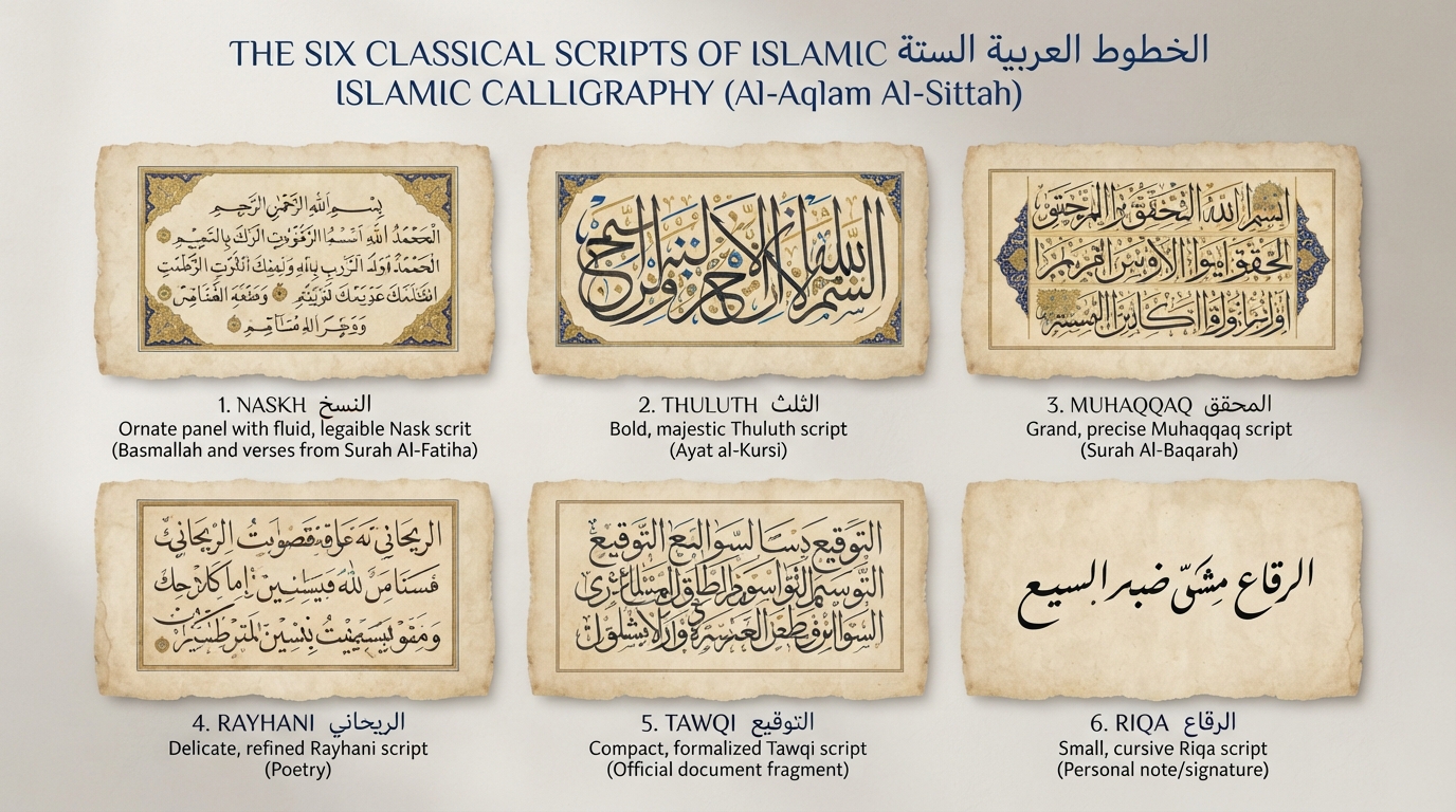
Ibn Muqla (working with his brother, by some accounts) is traditionally credited with formalizing what became known as the "Six Pens" — six proportioned scripts built on the al-khatt al-mansub system: thuluth, naskh, muhaqqaq, rayhani, tawqi', and riqa'. This six-script canon still structures how classical Islamic calligraphy is taught today, and it's the reference point behind style names you'll see across Arabic calligraphy style guides, including on font sites like this one.
The most consequential of the six, in practical terms, was naskh. Kufic was expressive and monumental but slow to write and not especially easy to read at length. Naskh was designed as a smaller, rounder, faster cursive — legible at book scale, quick enough for everyday correspondence, and clean enough for copying the Qur'an without sacrificing clarity. It caught on fast for exactly that reason: it solved a real problem Kufic didn't. Within a few centuries, naskh had displaced Kufic as the default script for books and documents across the Arabic-writing world, a shift the Wikipedia entry on Naskh) traces from early Umayyad-era reforms through to today, when naskh-based letterforms are literally the default Arabic typeface baked into Windows, iOS, Linux, and most of Google Fonts. If you've read an Arabic sentence on a phone screen today, there's a good chance the underlying letterforms trace their proportional logic back to a script Ibn Muqla helped formalize eleven centuries ago. You can see a modern digital descendant of that lineage on this site's naskh style page, and its more decorative sibling on the thuluth style page.
Ibn al-Bawwab and Yaqut al-Musta'simi carry it forward
Ibn Muqla's system wasn't the finished product — it was the starting point. About a century later, the calligrapher Ibn al-Bawwab (died 1022) took the proportioned-script framework and refined it, smoothing out inconsistencies and producing manuscripts still studied as models of the mature system. Ibn al-Bawwab's own reputation grew large enough that later calligraphers treated his refinements almost as canonical as Ibn Muqla's original rules.
The lineage continued into the thirteenth century with Yaqut al-Musta'simi, secretary to the last Abbasid caliph, who introduced a genuinely technical innovation: cutting the reed pen's nib at an oblique angle instead of straight across. That single change in how the tool met the page altered the character of every stroke made with it, giving the six scripts a more elegant, flowing quality. Yaqut's school became the reference point for generations of Persian and Ottoman calligraphers who followed, and — in a detail that rarely makes it into short summaries of this history — one of the key links in that chain of transmission was Shuhda bint al-Ibari, a female scholar and calligrapher trained directly in Ibn al-Bawwab's tradition, who in turn helped train Yaqut.
So the "proportioned script" you'll hear calligraphy teachers reference today isn't purely Ibn Muqla's original system. It's a three-generation refinement: Ibn Muqla's tenth-century geometry, Ibn al-Bawwab's eleventh-century polish, and Yaqut al-Musta'simi's thirteenth-century pen-cutting technique, layered on top of each other over roughly 350 years.
Why a tenth-century bureaucrat still matters to a font
It would be easy to file all of this under "interesting history" and move on, but the proportioned-script system is not just a historical artifact — it's the reason certain Arabic typefaces look "correct" and others look off to a fluent reader, even when both are technically legible. Type designers building digital Arabic fonts today are still, whether they think about it in these terms or not, working within proportional relationships that trace back to Ibn Muqla's dot-and-circle method: consistent stroke contrast, alif height as a reference unit, curves that echo a shared underlying geometry rather than each letter being drawn as an unrelated shape.
That's also why naskh-based fonts remain the safest, most versatile choice for body text and readable Arabic design, while more expressive scripts like thuluth are reserved for headlines, logos, and ceremonial use — a distinction this site's guide to Arabic calligraphy styles covers in more practical detail, alongside a broader look at the history of Arabic calligraphy. If you want to see the proportioned-script legacy in action rather than just read about it, the font generator lets you preview naskh and thuluth styles side by side and feel the difference a thousand years of refinement actually makes.
Frequently asked questions
Who was Ibn Muqla?
Ibn Muqla (c. 885/886–940) was an Abbasid-era vizier who served three separate terms as chief minister under different caliphs. Outside of politics, he is credited with developing al-khatt al-mansub, the 'proportioned script' system that standardized Arabic letterforms using geometric measurements.
What is the 'proportioned script' system?
It is a method for measuring Arabic letters against three fixed references: a rhombic dot made by the pen's nib, the height of the letter alif measured in dots, and a circle whose diameter equals that alif height. Rounded letters were checked against the circle, keeping proportions consistent instead of relying purely on a scribe's eye.
Did Ibn Muqla invent Naskh script?
He is traditionally credited with formalizing Naskh as one of the 'Six Pens,' developing it as a clearer, faster cursive alternative to the angular Kufic script. Naskh went on to become the standard script for books, correspondence, and eventually digital Arabic typefaces.
What happened to Ibn Muqla?
After losing power in a court struggle during his third term as vizier, Ibn Muqla was imprisoned and had his right hand cut off, followed later by his tongue. He died in prison in Baghdad in July 940.
Who continued Ibn Muqla's work?
The calligrapher Ibn al-Bawwab refined the proportioned-script system about a century later, and in the 13th century Yaqut al-Musta'simi introduced the oblique-cut reed pen, further shaping the six classical scripts still referenced in Arabic calligraphy instruction today.