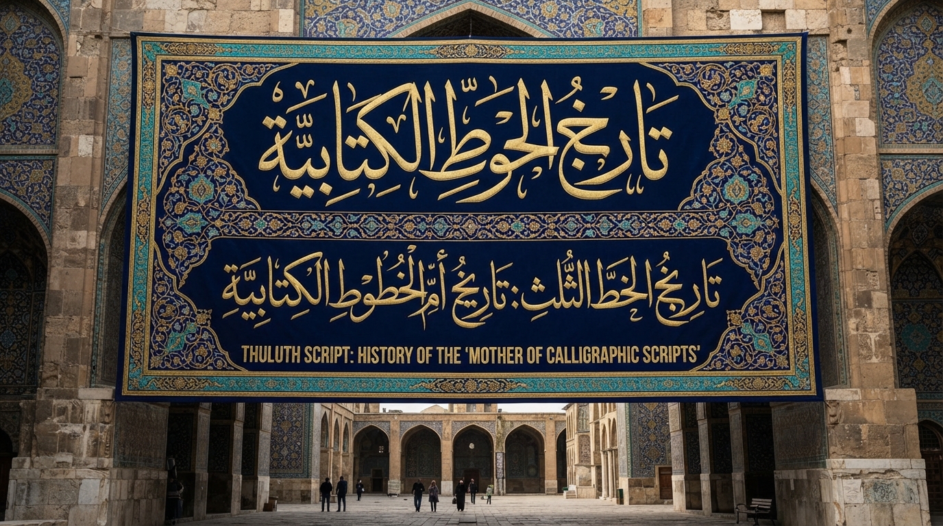
Calligraphers have a saying about Thuluth: you're not really a calligrapher until you can write it. That's not just a saying — Thuluth is widely regarded as the most technically demanding of the classical Arabic scripts, and for well over a thousand years it has been the script masters use to prove they've mastered the craft. Among calligraphers it's traditionally called umm al-khatt, "the mother of scripts" — as Arab News puts it, the title reflects how the script "has been encountered by many calligraphers" as the standard every other script gets measured against. This is the history of how Thuluth earned that title, and why it still carries weight today.
What the name actually means
Thuluth (ثلث) means "one-third" in Arabic, though calligraphers and historians don't fully agree on which third it refers to. Wikipedia notes one common explanation: that roughly one-third of each letter slopes or curves rather than running straight. Another ties the name to letter proportion: the narrowest point of a stroke measuring one-third the width of its widest point. A third theory, tied to the pen rather than the letters, holds that Thuluth was written with a nib cut one-third narrower than the pen used for tumar, an older, larger monumental script. All three explanations point to the same underlying idea — Thuluth is a script defined by careful, measured proportion, not free-hand flourish, whichever "third" the name is actually describing.
Born from the same system as Naskh
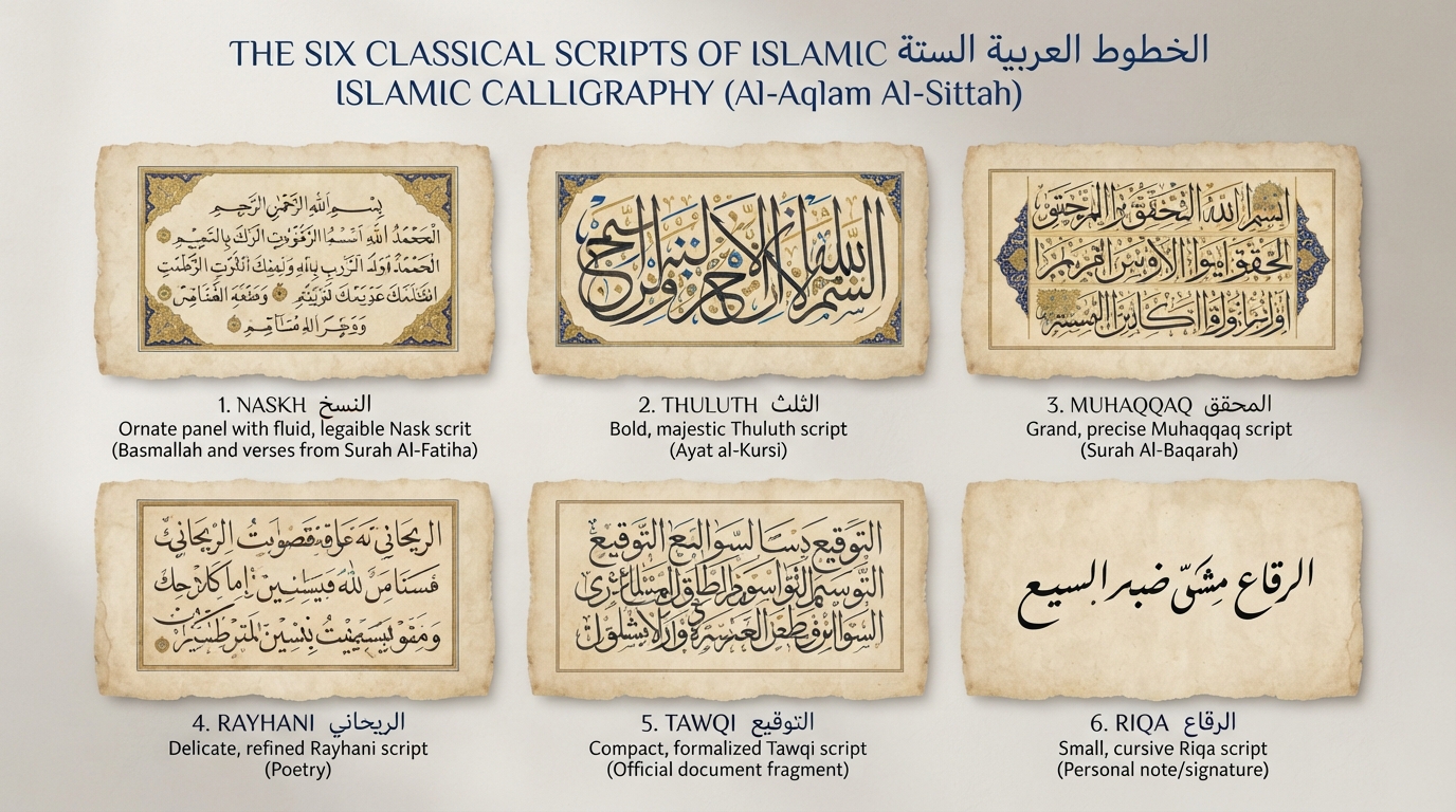
Like Naskh, Thuluth grew out of the proportioned-script system developed by the 10th-century calligrapher and Abbasid vizier Ibn Muqla, which measured every letter against a rhombic dot, the height of the alif, and a circle scaled to that height. Where Naskh used that system to produce a plain, readable working hand, Thuluth used it to produce something closer to a display script — large, elaborate, and built to draw the eye. Ibn Muqla is traditionally credited with formalizing Thuluth alongside five other scripts, a group covered in full in our guide to the six classical scripts of Islamic calligraphy. His system was carried forward by later calligraphers including Ibn al-Bawwab, and centuries later, Ottoman calligraphers pushed Thuluth further still: Sheikh Hamdullah reworked it in the 15th century, Hafiz Osman refined it again in the 17th, and Mehmed Şevki Efendi gave it something close to its modern form in the late 19th century, building on the earlier standard set by Mustafa Râkim Efendi.
A script that refuses to be practical
Thuluth's defining trait is that it was never built for speed. Its vertical strokes slant, its horizontal strokes carry a deep curve, and many of its descending letters hook back up at the end. Letters interlace with one another, stack vertically, and extend well above and below the baseline in ways Naskh deliberately avoids. Several letters have multiple alternate forms a calligrapher can choose between depending on the composition, and ligatures — two or more letters fused into a single connected form — appear constantly. None of that is an accident of style. It's the direct opposite of what a script needs to be fast to write, which is exactly why Thuluth was never adopted for everyday correspondence the way Naskh and the more compact Ruq'ah eventually were.
Why it got the monuments instead of the manuscripts
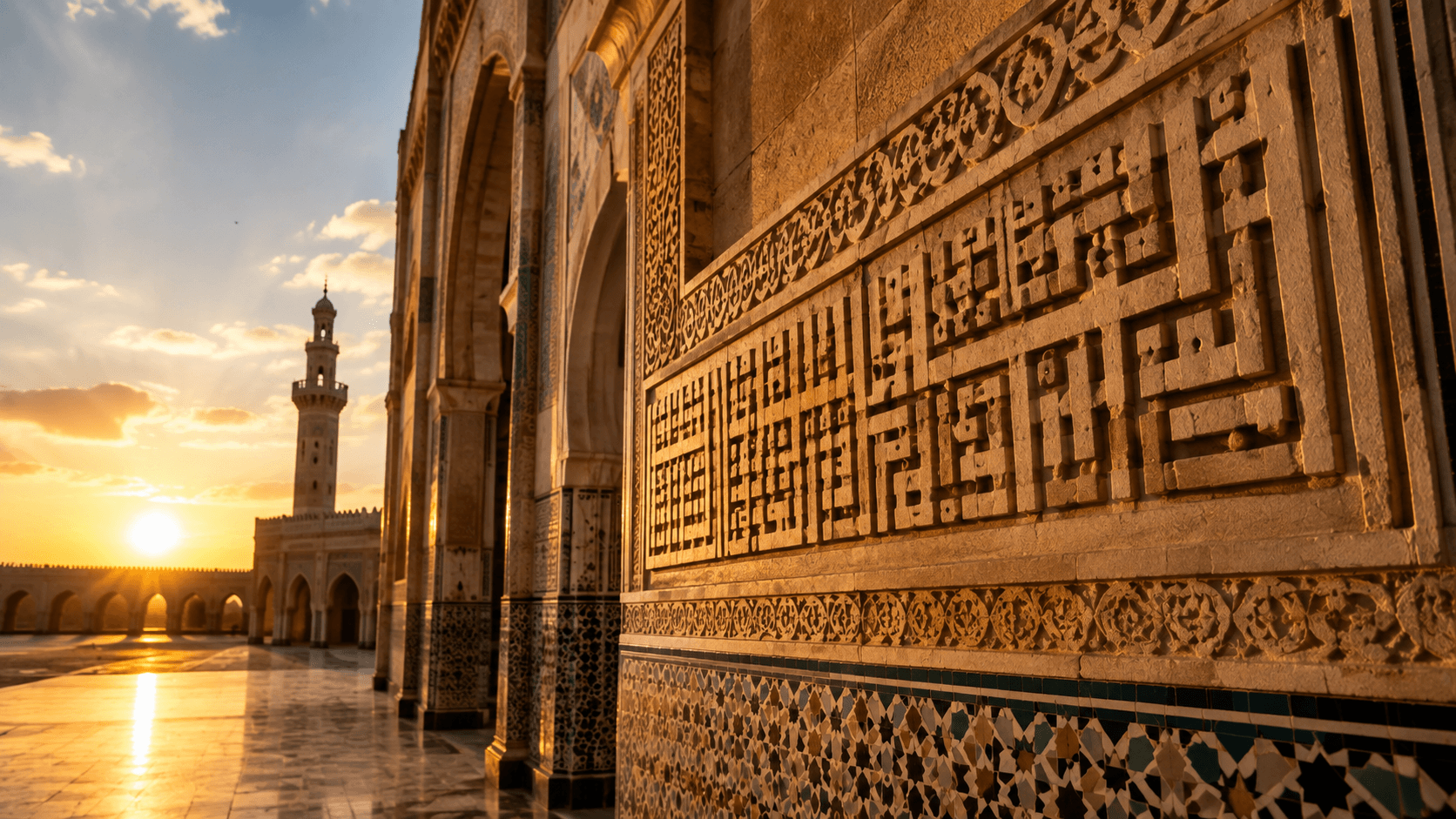
That impracticality for fast writing turned into a strength the moment size and visual weight became the point. Thuluth's large, elegant letterforms hold up at a distance and at scale in a way smaller scripts don't, which made it the preferred choice for exactly the kind of writing meant to be seen rather than read quickly: Qur'anic chapter headings and frontispieces, monumental mosque inscriptions, titles on manuscripts, and official state documents where visual authority mattered as much as the words themselves. Thuluth appears prominently in the decorative bands on major mosques across the Islamic world — including, historically, the Umayyad Mosque in Aleppo and the Shah Mosque in Isfahan, and in the Qur'anic inscriptions covering the Kaaba's kiswah at Masjid al-Haram — and it's traditionally paired with a smaller companion script, usually Naskh, used for the dense body text beneath a Thuluth heading or title. This is the same logic our guide to Kufic script in Islamic architecture touches on from the angular side: different scripts were assigned to different jobs based on how they actually behaved on a wall or a page, not just how they looked.
That division of labor between a large display script and a smaller working script for the surrounding text is also why Thuluth rarely needed to compete with Naskh for the same job. A calligrapher laying out a page or a wall would use Thuluth exactly once or twice, for the part meant to announce itself, and Naskh for everything the reader was actually expected to read start to finish — a pairing you'll still see echoed in modern logo and title design today, where a bold display face carries a name and a plainer typeface carries the supporting text underneath it.
Thuluth's reputation as the technical peak of the craft is well documented among calligraphers themselves — historically, mastering Thuluth has been treated as proof that a calligrapher has mastered the underlying discipline that all six classical scripts share, which is likely the real root of the "mother of scripts" title: not that every other script literally descends from it, but that everything a calligrapher needs to know shows up, in its most demanding form, in Thuluth.
That monumental role produced its own specialized variant. Jali Thuluth ("clear" or "manifest" Thuluth) widens the spacing between and within letters and fills the surrounding space with dense clusters of diacritical marks, making it legible from much further away than standard Thuluth — the version you actually see stretched across a dome, a minaret band, or a large banner rather than a page. The underlying letterforms are the same script; the difference is entirely about the distance the writing is meant to be read from, which is a good illustration of how deliberately Thuluth's variations were engineered around specific real-world uses rather than personal style alone.
Thuluth today
Thuluth never had to reinvent itself for the modern era the way Kufic did for logos or Naskh did for body text — its job barely changed, because the underlying reason people reach for it never really changed either. It's still the script reached for when something needs to look formal, permanent, or ceremonial rather than merely legible: wedding invitations, commemorative plaques, official titles, and any design where the calligraphy itself is meant to carry weight. Our guide to Arabic wedding invitation fonts covers exactly this use case in more depth. You can preview Thuluth-style lettering with your own text using the Arabic calligraphy generator, or browse dedicated Thuluth options on the site's Thuluth style page.
A script that took a thousand years to become "impractical enough" to be reserved for the most important writing in the room is, in its own way, a study in how calligraphy assigns status: not by making letters easier to read, but by making them harder to write well — and then reserving the results for the moments that genuinely deserve that level of effort, from a Mamluk-era mosque wall to a modern wedding invitation someone will keep for decades.
Frequently asked questions
What does 'umm al-khatt' mean?
Umm al-khatt is Arabic for 'mother of scripts,' a traditional title calligraphers give to Thuluth because mastering its rules is considered proof that a calligrapher has mastered the discipline underlying Arabic calligraphy as a whole.
What does the word 'Thuluth' mean?
Thuluth means 'one-third' in Arabic. Historians and calligraphers offer several explanations for the name, including the slope of its strokes, the ratio between a stroke's narrowest and widest points, and the width of the pen nib used to write it — but all point to the same idea of careful, measured proportion.
Why wasn't Thuluth used for everyday writing?
Its large size, deep curves, interlacing letters, and frequent ligatures make it slow and demanding to execute well, so scribes used faster, plainer scripts like Naskh for correspondence and books, reserving Thuluth for titles, headings, and monumental inscriptions where visual impact mattered more than writing speed.
Is Thuluth still used today?
Yes, for largely the same reasons it always was — it's the go-to script for wedding invitations, plaques, formal titles, and any design meant to feel ceremonial or authoritative rather than purely functional.