Walk into most mosques, madrasas, or palaces built across the Islamic world and you'll see calligraphy, geometric star patterns, and vegetal scrollwork sharing the same wall — sometimes the same square foot of tile. It's easy to lump all of it together as "Islamic art." It isn't one thing. Calligraphy is writing. Geometric pattern is applied mathematics. And the swirling vine-and-leaf work that often fills the gaps between them — the arabesque — is a third, separate tradition built from stylized plant forms. Each developed its own logic and its own history, and they only look unified because craftsmen spent centuries learning how to combine them without one undermining the other. That combination is the actual skill, and it's one you can borrow for a modern logo, poster, or wall piece once you understand how it works.
Three traditions, not one
The Metropolitan Museum of Art's Heilbrunn Timeline of Art History treats calligraphy, geometric design, and vegetal ornament as distinct major ornamental modes in Islamic art, not variations on a single style. Calligraphy carries actual language — a Qur'anic verse, a name, a line of poetry — meant to be read letter by letter in a fixed order. Geometric pattern doesn't say anything at all. According to the Met, it's built from a small set of repeat units — circles and interlaced circles, squares and other polygons, and star patterns formed by inscribing polygons inside circles — that are "combined, duplicated, interlaced, and arranged in intricate combinations."
The arabesque is different again: stylized, largely abstracted vegetal and foliate scrollwork. The Met notes it's largely without symbolic meaning on its own, aside from occasional references to gardens or paradise, and that the word "arabesque" itself wasn't coined by Muslim artists — it's a European term dating to the early 19th century, after Napoleon's Egyptian campaign brought this ornament style to wider European attention. So when all three appear together on one wall, you're looking at three separate design systems that happen to have been layered by people who understood exactly how far each one could be pushed before it started fighting the others.
The math behind the geometry
Geometric pattern is the tradition most directly rooted in mathematics, and its development is well documented. Simple, isolated geometric shapes — eight-pointed stars, for instance — appear as early as the ninth century, including in the Great Mosque of Kairouan, built in 836. Over the following centuries the vocabulary expanded: six-, eight-, and ten-point girih patterns became common between the 11th and 13th centuries, and by the 16th century artisans were producing far more complex 14- and 16-point star compositions. Despite the complexity, these patterns were constructed with nothing more than a ruler and a compass, built on underlying grids using reflection and rotation symmetry — which is also why the patterns can extend outward indefinitely with no obvious edge. That "infinite" quality isn't a metaphor; it's a direct result of how the tessellation is constructed.
How calligraphy and geometry actually get combined
In practice, the two traditions are almost never merged into a single continuous surface. They're layered, with each occupying its own zone.
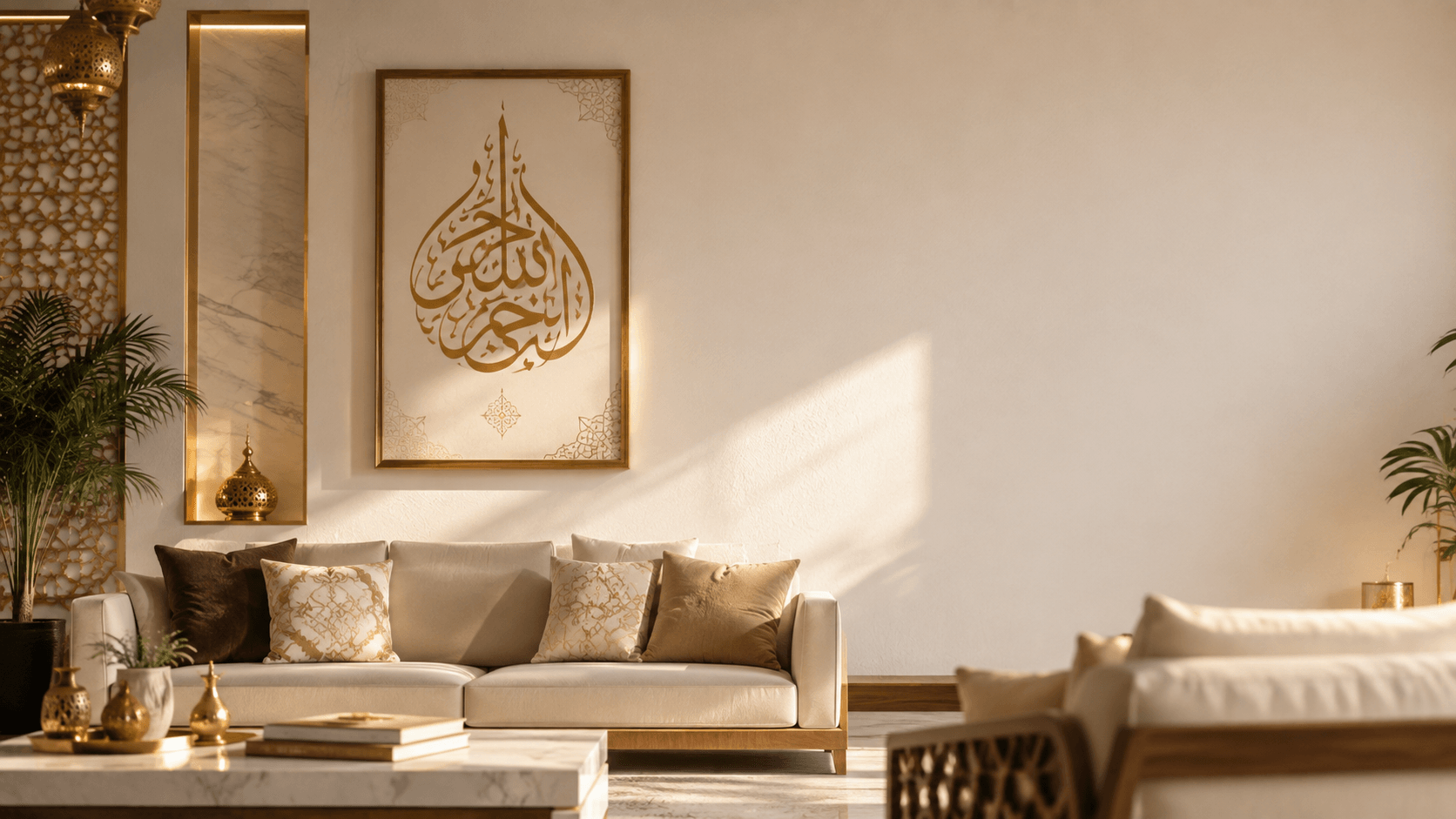
The most common structure is the central medallion: a calligraphic inscription — often a name, a religious phrase, or a dedication — placed inside a roundel or cartouche, itself set at the center of, or framed by, a geometric or vegetal field. You see this on Qur'an frontispieces, on the crowns of domes, and on carpets where a central medallion of text or a symbolic motif sits inside rings of geometric or arabesque border work.
The second common structure is banding: a calligraphic inscription running as a horizontal frieze along the top of a wall of geometric tile work, or wrapping an archway, or circling the base of a dome. This is the pattern you'll see most clearly in Kufic script's architectural history — angular monumental Kufic reads well at a distance and at height, which made it a natural choice for these inscription bands running above or alongside dense geometric fields.
What you rarely see, at least in work meant to be read, is calligraphy dropped directly on top of a busy geometric field with no separation. It happens — some star patterns do contain small calligraphic elements nested inside their points — but it's the exception, and it comes at a real cost to legibility.
Why the two rarely compete for the same space
The underlying design logic is about role, not aesthetics. Pattern functions as field, texture, and rhythm — it has no reading order and no single focal point, because repetition is the whole point. Calligraphy functions as content — it has a specific direction (right to left), a specific sequence, and a specific point where your eye is supposed to land and start.
When you set text directly on top of a dense pattern with no separation, you destroy the one thing that distinguishes "this is what you read" from "this is the texture around it." Historically, artists solved this with contrast, not separation alone: the inscription band is usually larger in scale than the pattern's repeat unit, it typically sits in calmer, more open space even where the surrounding field is dense, and it's frequently rendered in a different material, glaze color, or relief depth than the pattern beside it. Contrast — in scale, density, and material — is what lets both traditions occupy the same wall without either one disappearing.
Practical guidance for combining calligraphy with geometric pattern today
If you're pairing Arabic calligraphy with geometric pattern in a modern logo, poster, or wall piece, the same principles translate directly:
Give the calligraphy its own field. Put geometric pattern in a border or background band, and keep the immediate area behind your text calmer — even a thin gap, a solid color block, or a soft vignette breaks the pattern before it touches the letterforms.
Prioritize scale and density over opacity. If pattern has to sit directly behind text, don't just fade its opacity uniformly. Reduce its scale and density specifically in the zone behind the letters, so the text gets real visual breathing room rather than a lighter version of the same busy field.
Use pattern as a frame, not a fill. The classical central-medallion structure — pattern establishing the edges, calligraphy occupying a calm center — is the safest starting layout for a logo, a poster, or a social graphic, and it's the structure with the longest track record.
Match complexity to script style. A dense geometric pattern paired with an already ornate, high-contrast script like Thuluth will compete with itself. Pair busy pattern with a simpler, more structural script — Kufic or Naskh — or pair an ornate script with a plainer field.
Test in grayscale at thumbnail size. Shrink your composition, strip the color, and check whether it still reads as "text plus frame." If the pattern and the calligraphy blur into a single gray mass, the contrast isn't doing its job yet, no matter how good it looks at full size.
Bringing it into your own work
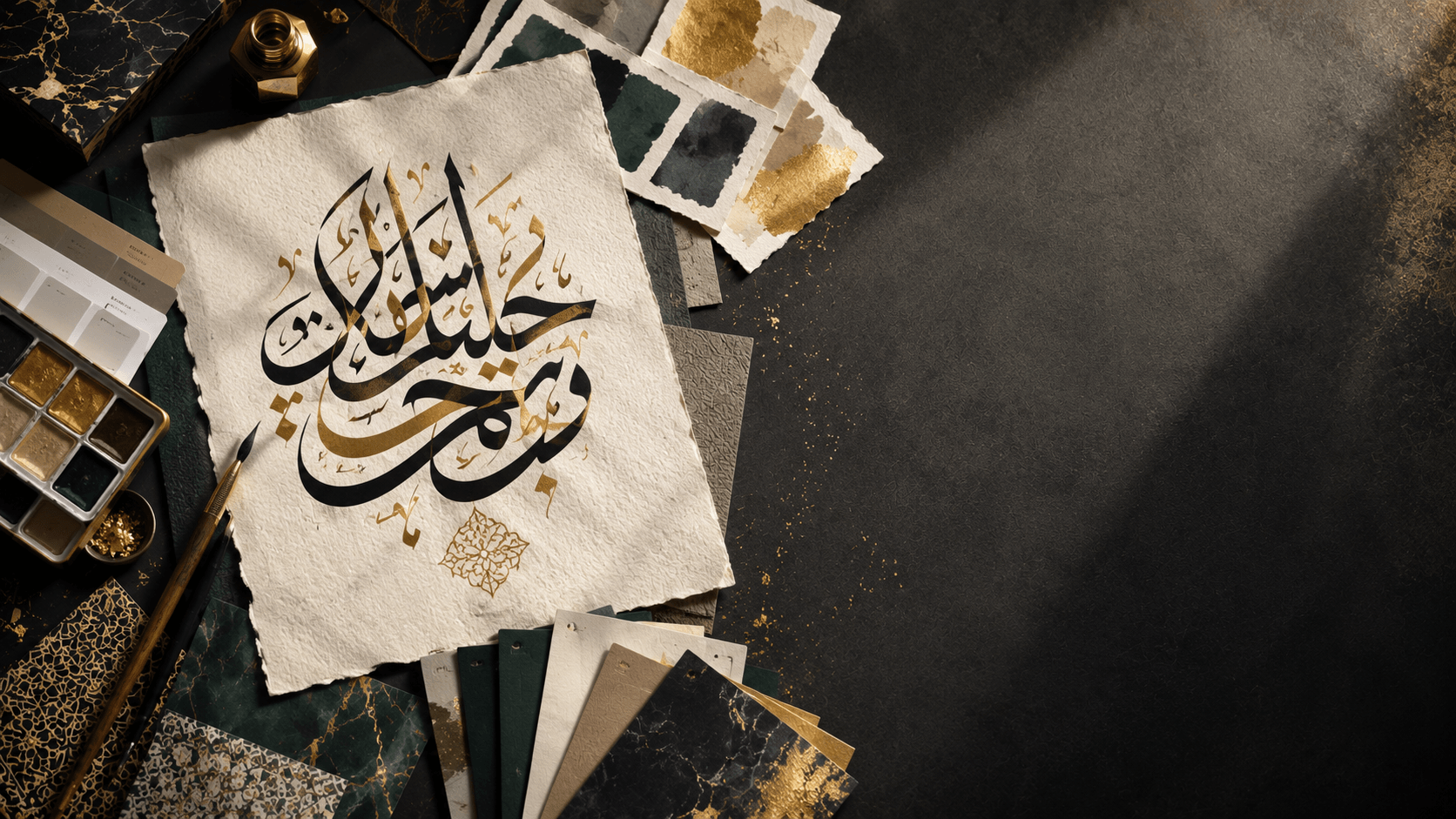
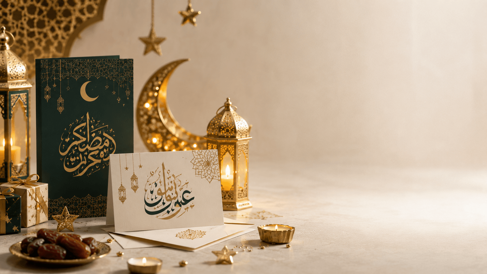
These principles hold whether you're designing a wall hanging, a wedding suite, or a social post. Start with the calligraphy: use the Arabic calligraphy generator to test how a phrase looks in a few different style families, particularly if you're planning to pair it with a geometric border, since a more angular, modular style will sit more comfortably next to geometric tessellation than a highly cursive one. Build the geometric or arabesque framing as a separate layer, and only bring the two together once each one works on its own. For more on where this combination shows up in home and wall decor specifically, see our guide to Islamic wall art, and for the broader history behind the script itself, our short history of Arabic calligraphy is a good next stop.
Frequently asked questions
What's the difference between geometric pattern and arabesque in Islamic art?
Geometric pattern is built from mathematical tessellation — circles, polygons, and star shapes constructed with a ruler and compass. Arabesque is stylized, abstracted vegetal and foliate scrollwork derived from plant forms. Both are nonfigural decoration, but they come from different source material and follow different construction logic, even though they're often combined in the same piece.
Is Arabic calligraphy considered a type of Islamic geometric art?
No. According to the Metropolitan Museum of Art, calligraphy, geometric pattern, and vegetal ornament are treated as separate major ornamental traditions in Islamic art. They're frequently combined on the same object or building, but calligraphy is script-based and content-bearing, while geometric pattern is abstract and repetitive with no inherent 'meaning' to read.
Can I combine Arabic calligraphy with geometric pattern in a modern logo or poster?
Yes, and it's a well-established combination historically. The key is contrast: keep the pattern denser at the edges or in a border, keep the area directly behind your calligraphy calmer, and test the composition in grayscale at a small size to make sure the text still reads clearly as separate from the pattern around it.