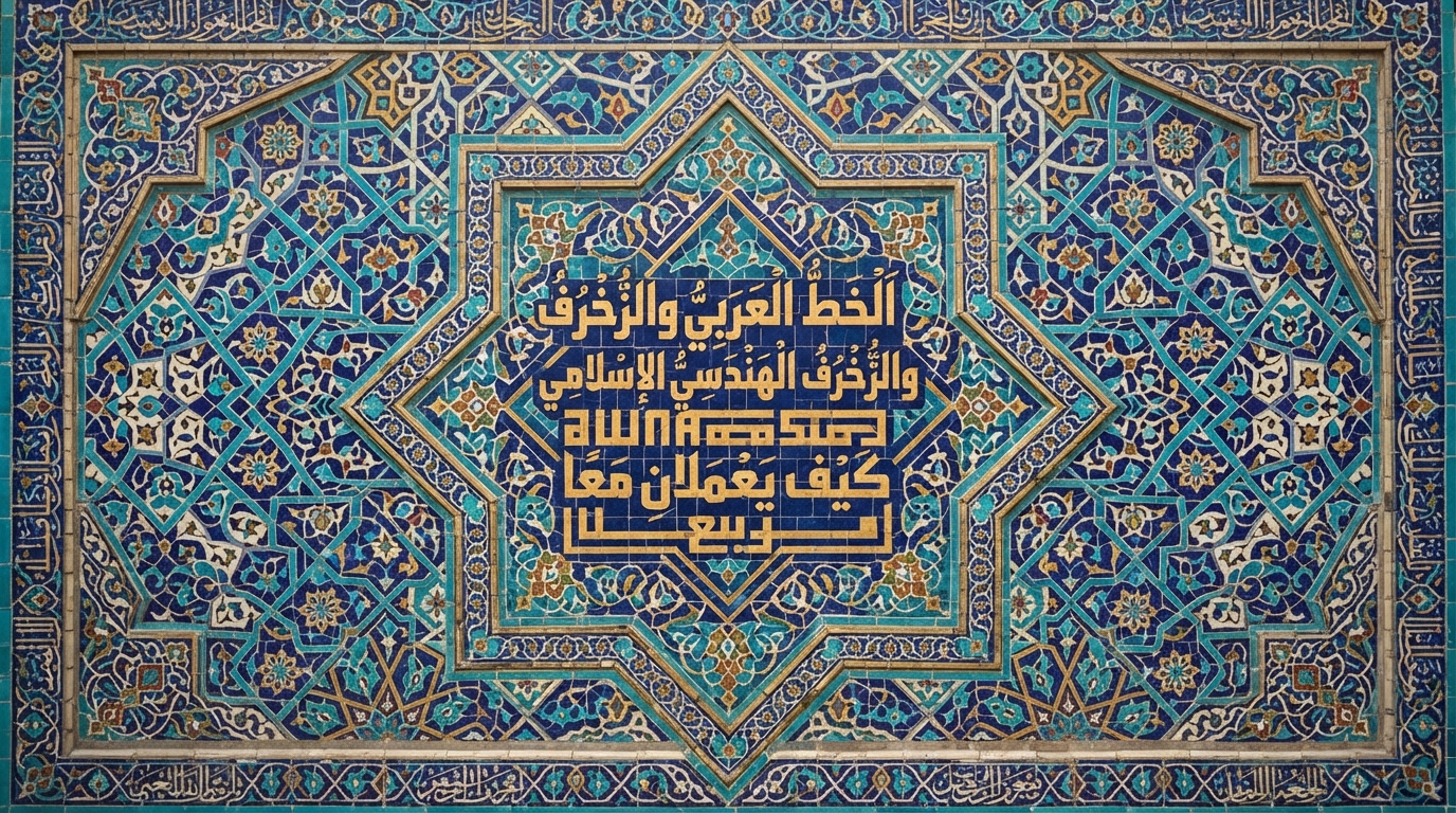
A logo built from Arabic calligraphy has to do something a page of body text never has to: survive being shrunk to a 16-pixel favicon, printed in one flat color on a receipt, and still read as the same mark from across a storefront. Most of what makes calligraphy beautiful — the hairline strokes, the layered diacritics, the deliberate imbalance between thick and thin — actively works against it at that scale. The wordmarks that hold up aren't the most elaborate ones. They're built around a small set of principles that have nothing to do with which script looks prettiest and everything to do with what survives reduction.
Reduction is the real design brief
Arabic script connects most letters to their neighbors, changes letterforms depending on position in a word, and carries dots and diacritical marks above and below the baseline. Traditional calligraphy also relies on real stroke-width contrast — a thick downstroke next to a hairline upstroke, produced by the angle of the qalam's cut nib — and that contrast is exactly what disappears first once strokes get thin enough to alias or vanish at small sizes.
The practical fix isn't to avoid calligraphic character altogether; it's to design for the smallest size first, not the largest. Favor a form with fewer disconnected fine details rather than more. Thicken your minimum stroke weight beyond what looks right at presentation size, because it needs to survive being rendered at a fraction of that size. Treat diacritics as optional in the mark itself — keep them in the wordtype used elsewhere in your branding if the meaning depends on them, rather than forcing them into a logo that needs to work at 16 pixels. And test at the actual target sizes — a real 16×16 or 32×32 favicon, a real app icon grid — not just a scaled-down version of your presentation file, since screen rendering and print reduction behave differently.
Matching script personality to brand personality
Different Arabic script styles carry genuinely different associations, and picking one is closer to picking a typeface family than picking a "look." Kufic is angular and built from modular, near-geometric forms — which is part of why it pairs so naturally with the geometric patterns common in Islamic architecture, and why it tends to read as structured, modern, or technical in a brand context. Thuluth is elegant and heavily cursive, with a defining rule that roughly one-third of each letter's stroke slopes at an angle, and it was historically used for ceremonial and monumental purposes — Qur'anic chapter headings, titles, and mosque inscriptions — which is part of why it reads as heritage or luxury today. Ruq'ah is plain, quick, and was standardized specifically as an efficient everyday hand, which is why it tends to read as approachable or personal rather than formal.
These aren't just stylistic impressions — script choice carries real, documented symbolic weight at the national level, which is a useful benchmark for how deliberately brand designers should be thinking about it. The Shahada on Saudi Arabia's flag is written in Thuluth script, a deliberate choice for a script associated with formality and religious gravity. Iraq's flag, meanwhile, carries the takbir ("Allahu Akbar"), added in 1991 and rendered in traditional Kufic script — a script choice that reads as structured and monumental rather than personal. If national symbols are deliberate about which script carries which meaning, a brand identity should be too.
The tension between authenticity and minimalism
Classical Arabic letterforms aren't arbitrary — they're governed by proportion systems developed over roughly a millennium. The best-known system, traditionally credited to the 10th-century Abbasid vizier Ibn Muqla, measures every letter against a base unit (the rhombic dot, or nuqta) and a circle whose diameter equals the height of the letter alif. That system is why Naskh and related scripts have consistent, learnable proportions rather than freeform shapes.
Modern minimalist branding pulls in the opposite direction: strip a letterform down to its simplest possible geometry, remove anything that isn't load-bearing. Push that far enough and you can cross the point where the underlying proportion system stops holding — which is often the moment a mark stops reading as authentically Arabic to someone who actually reads the script, even if a non-Arabic-reading audience can't tell the difference. Mohamed Gaber, the designer behind the widely used Google Fonts typeface Cairo, has described the goal for Arabic type design as creating a typeface that matches Latin design sensibilities without bending the Arabic letters. That's the same tension a logo designer faces at the mark level: simplify the ornament and the flourishes first, and protect the underlying letter structure — bowl heights, baseline relationships, the core skeleton — for as long as possible. You can see that balance in practice on this site's own Cairo font page, which pairs a crisp, minimal structure with proportions that still read clearly as Arabic rather than Latin letters wearing Arabic dress.
The single-color test
Real logos get reproduced in a single flat color constantly — embossed on leather, laser-etched, engraved into metal, screen-printed on fabric, faxed, or reduced to a plain black-and-white favicon. A mark that depends on color contrast between overlapping strokes — a trick some multi-layer calligraphic designs lean on — will collapse into an unreadable blob the moment it's forced into one flat fill.
The test is simple: convert your mark to solid black on white, no grays, no gradients, and check whether the letterforms and the counters — the enclosed negative space inside and between letters — still read clearly. If two strokes only worked as distinct shapes because they were different colors, the mark needs a structural redesign, not a recolor. Do the same check at a rough approximation of the smallest size the mark will realistically need to survive, whether that's a business-card imprint or a browser tab favicon.
It's worth running this test earlier than most designers do — before a client sees color options, not after. A mark that only works with a two-tone treatment isn't a finished wordmark yet; it's a color illustration with letters in it. Fixing that after a client has already approved a color version is a much harder conversation than catching it at the black-and-white stage.
A practical checklist before you finalize a wordmark
- Does it still read as the same word at 16 pixels, not just at presentation size?
- Does it hold up as a single flat color with no gradients or overlapping tints?
- Are diacritics necessary inside the mark itself, or can they live in the surrounding wordtype instead?
- Does the script style actually match the brand's personality, rather than just "looking Arabic"?
- Have you checked it isn't accidentally mirrored — a surprisingly common production mistake when a mark moves between RTL and LTR layout software?
Getting the details right
Once the mark itself is solid, the rest of the identity usually needs to pair Arabic and Latin type together — on a business card, a sign, or a bilingual website header. Our guide to pairing Arabic and Latin fonts for bilingual typography covers how to choose a Latin companion that doesn't visually overpower the Arabic mark, and our broader guide to choosing Arabic fonts for logos, invitations, and social media walks through selection criteria beyond just the script family. When you're ready to prototype, the Arabic calligraphy generator lets you test a phrase across dozens of styles side by side, including the Kufic, Thuluth, and Ruq'ah families discussed here, before you commit to reducing any one of them into a finished mark.
Frequently asked questions
Which Arabic script style works best for a small logo mark?
Scripts with more modular, angular structure — like Kufic — tend to reduce best because they rely less on fine stroke-weight contrast. Highly cursive, ornamental scripts like Thuluth or Diwani can still work but usually need significant simplification to survive being shrunk to a favicon or app-icon size.
Do I need diacritics (harakat) in an Arabic logo?
Usually not. Diacritics add fine detail that tends to disappear at small sizes and can clutter a mark meant to be recognized instantly. Most brand wordmarks omit them and rely on context, keeping them only in longer-form wordtype elsewhere in the identity if precise pronunciation matters.
Can I combine Arabic and Latin script in one logo?
Yes — this is common for bilingual brands, but it takes deliberate pairing rather than just placing both scripts side by side. See our guide to pairing Arabic and Latin fonts for bilingual typography for how to balance weight, size, and style between the two scripts.