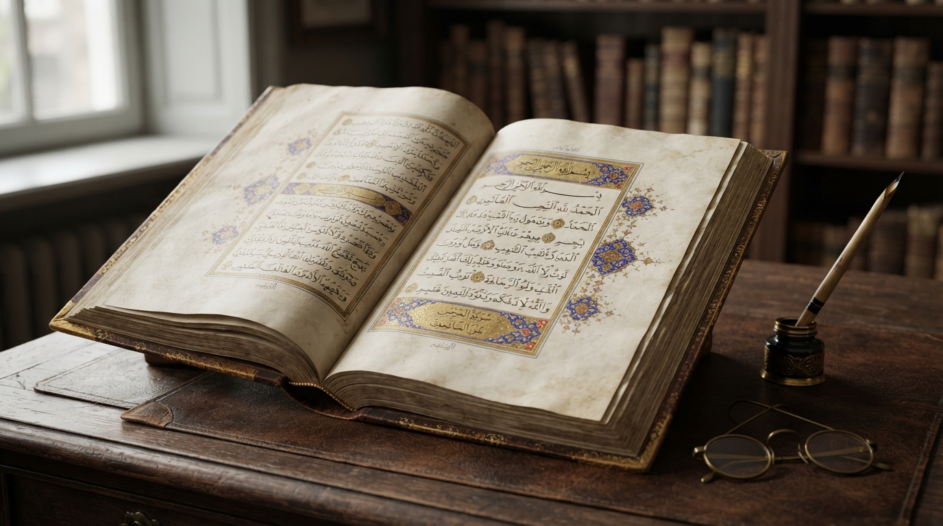
If you've read an Arabic newspaper, a paperback novel, a road sign, or this sentence rendered on a phone screen, you've read Naskh. It's the plainest-looking of the major Arabic calligraphic styles, and by a wide margin the most useful one — the script that quietly won the job of carrying everyday Arabic text for more than a thousand years. Where Kufic ended up on monuments and coins, and Thuluth ended up on mosque domes and formal titles, Naskh ended up in books, letters, Qur'ans, and eventually on screens. This is the story of how a script built for copying became the default for reading.
A script named after its job
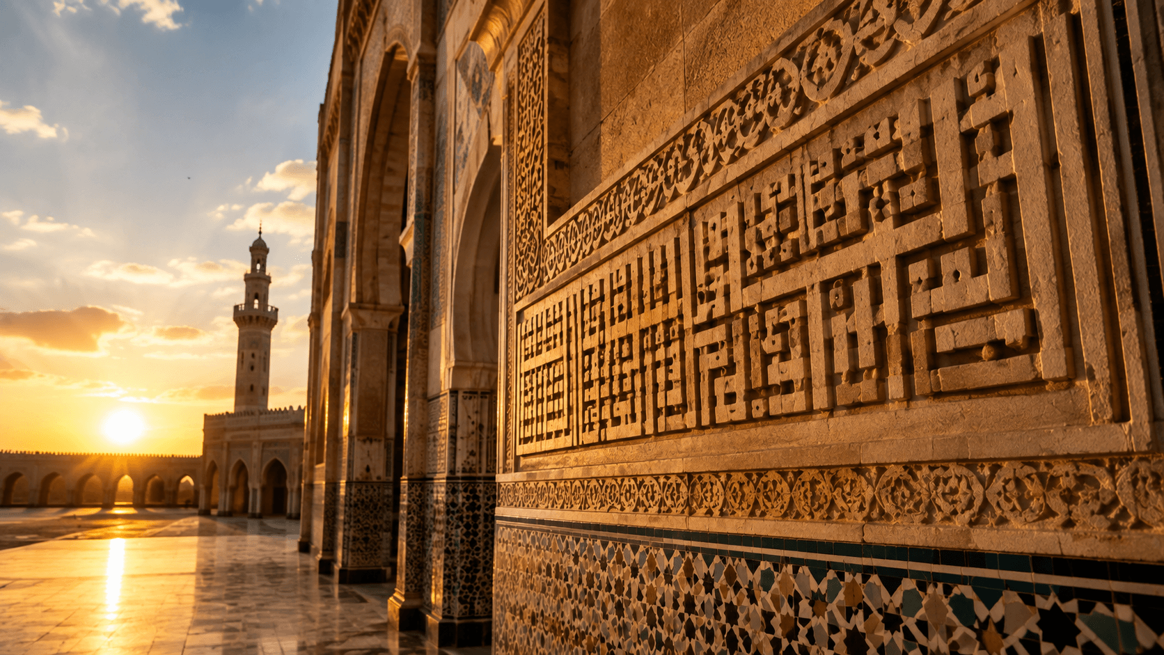
The name Naskh comes from the Arabic root that gives the verb nasakha, "to copy" or "to transcribe," and the noun nāsikh, "copyist." That's not a later nickname — it describes exactly what the script was for. Naskh was the working hand of scribes: fast enough to write at length, legible enough to read at length, and regular enough that a page copied by one scribe looked consistent with a page copied by another decades later. Compare that to Kufic, which is angular, wide, and slow to execute — striking when carved into stone or laid across a mosque wall, impractical for copying an entire book by hand, letter by letter, for hours at a stretch. Naskh existed to solve the problem Kufic couldn't: getting a large amount of text down accurately, in a reasonable amount of time, in a form the next reader could actually use.
Ibn Muqla and the proportioned system
Simple, cursive hands for everyday correspondence and record-keeping existed long before Naskh had formal rules. What turned that everyday hand into a disciplined calligraphic style — one that could be taught, measured, and reproduced consistently by different scribes — was the work of the Abbasid vizier and calligrapher Ibn Muqla (c. 885–940). Ibn Muqla is credited with developing al-khatt al-mansub, the "proportioned script" system: a geometric method for measuring every letterform against three fixed units — the rhombic dot made by a single stroke of the pen (the nuqta), the height of the letter alif, and a circle whose diameter equals that alif height. Every other letter in the alphabet was then defined as some multiple or fraction of those three units.
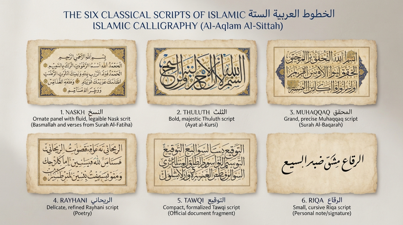
That system mattered because it made a script's proportions portable. A calligrapher in one city could teach it to a student in another, and the results would still look like the same script rather than a personal improvisation. Ibn Muqla is traditionally credited with using this method to formalize six major scripts in total — a canon covered in more detail in our guide to the six classical scripts of Islamic calligraphy — with Naskh serving as the plain, readable end of that spectrum and Thuluth as its more ornamental counterpart. Ibn Muqla's own career ended badly: he served three separate terms as vizier, fell out of favor, and died in prison in Baghdad in 940. His script survived him by more than a millennium. A generation later, the calligrapher Ibn al-Bawwab refined the proportioned system further; his surviving Qur'an manuscript, held today in Dublin's Chester Beatty Library, is one of the earliest complete examples of the mature style.
Why Naskh replaced Kufic for the Qur'an
For roughly the first three centuries of Islam, Kufic was the script of the Qur'an: angular, monumental, closer to a formal display type than to handwriting. According to Encyclopaedia Britannica, naskhi script developed out of everyday, practical Arabic handwriting used for administrative and business documents — distinct from the more formal book hand reserved for Qur'ans — and beginning around the 11th century it became "widely used for copying the Qur'an," eventually establishing itself as, in Britannica's words, "perhaps the most popular script in the Arab world."
The reasons were practical rather than aesthetic. Naskh's letters sit on an even baseline, its ascenders and descenders are short and consistent, and its strokes carry much less contrast between thick and thin than Thuluth or Muhaqqaq do. None of that is dramatic. All of it is legible. A page of Naskh doesn't just look tidy — it's genuinely faster to read at length, which mattered enormously for a text being copied and studied by hand, over and over, across an empire that stretched from Iberia to Central Asia.
Arabic letters change shape depending on where they fall in a word — isolated, initial, medial, or final — and most of them connect to their neighbors, similar to cursive handwriting. Naskh keeps those positional forms unusually consistent and predictable: a given letter looks recognizably like itself whether it opens a word or sits buried in the middle of one. That predictability is a big part of why Naskh scans quickly even to inexperienced readers, and it's also exactly the property a scribe needs when copying the same word thousands of times across a manuscript without introducing subtle drift in the letterforms.
From the copyist's pen to the printing press
Naskh's job didn't end with the manuscript. When Arabic-script printing presses began operating in the Middle East in the 19th century, they faced a version of the same problem Ibn Muqla had solved for scribes centuries earlier: how to cut a typeface that stayed legible at small sizes without needing hundreds of hand-drawn ligatures for every possible letter combination. Naskh's evenness made it the natural candidate, and Naskh-based printing type became the standard for Arabic-language newspapers, books, and government documents through the 19th and 20th centuries. That lineage runs directly into digital type today — our guide to the best free Google Fonts for Arabic calligraphy covers Amiri, a modern scholarly revival of the Naskh-style type cut for Cairo's Bulaq Press in the 19th century, redrawn for screens rather than metal.
Naskh today: the backbone of digital Arabic type
Open the font picker on almost any device and the default Arabic system font will be a Naskh design, or something very close to one. Noto Naskh Arabic, Google's own contribution to the category, exists specifically to give designers a dependable, neutral Naskh face that renders consistently across platforms and pairs cleanly with Latin type in multilingual layouts. Along with Amiri, Scheherazade, and dozens of other webfonts, it belongs to the same lineage Ibn Muqla started: letters proportioned by rule rather than by individual flourish, built to be read rather than admired.
That's also why Naskh remains the practical starting point for most Arabic design work today — body copy, UI text, long-form articles, anything meant to carry meaning rather than draw attention to itself. Rendering Naskh correctly on the web depends on getting letter-joining and shaping right, which is worth understanding if you're setting Arabic type yourself; see our guides on OpenType features and ligatures in Arabic fonts and RTL web design for the mechanics. If you just want to see how a Naskh-style font handles your own text, the Arabic calligraphy generator is the fastest way to check — a script built more than a thousand years ago for copyists is still, letter for letter, running most of the Arabic internet.
Naskh's real achievement isn't any single flourish; it's restraint. Every rule Ibn Muqla built into it — the fixed dot, the measured alif, the level baseline — exists to make the script disappear behind the words it's carrying. That's an unusual legacy for a calligraphy style, but it's exactly why Naskh outlasted almost every script designed to outshine it.
Frequently asked questions
What does the word 'Naskh' actually mean?
Naskh comes from the Arabic verb nasakha, meaning 'to copy' or 'to transcribe.' The related noun nāsikh means 'copyist' — a fitting name for a script designed specifically for fast, legible, repeatable handwriting rather than display.
Who invented Naskh script?
No single person invented it — practical cursive hands for everyday writing existed for centuries before it had formal rules. The 10th-century calligrapher Ibn Muqla is credited with codifying Naskh into a disciplined, geometrically proportioned style as part of his six-script system, and Ibn al-Bawwab refined that system a generation later.
Why did Naskh replace Kufic for writing the Qur'an?
Kufic is angular and slow to write, which made it excellent for monumental inscriptions but impractical for copying long texts by hand. Naskh's even letter spacing, short ascenders and descenders, and consistent baseline made it faster to write and easier to read at length, so it gradually took over Qur'anic copying starting around the 11th century.
Is Naskh still used for digital fonts today?
Yes — most default Arabic system fonts and the majority of Arabic webfonts built for body text, including Google's Noto Naskh Arabic and the widely used Amiri typeface, are Naskh-based designs. Its clear, evenly spaced letterforms are exactly what makes text legible at small sizes on screens.