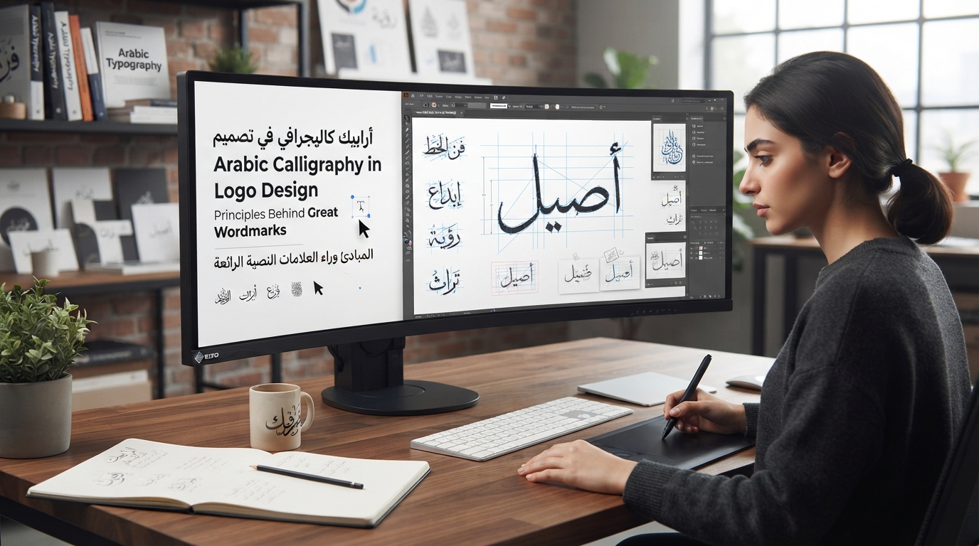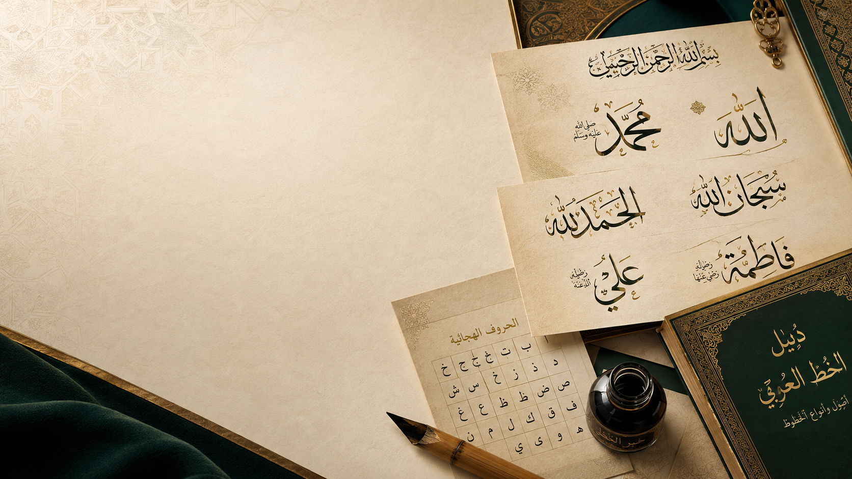
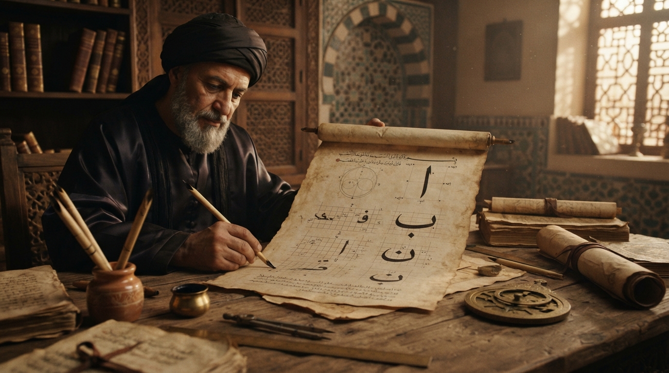
Everything else on this site is built around a digital generator, but Arabic calligraphy is a hand skill first, and it was one for well over a thousand years before anyone typed it. If you actually want to understand how these letterforms work — not just which typeface looks good on a screen — the fastest route is still a pen, ink, and paper. This is a starting guide for doing exactly that: what tools you actually need, why almost every teacher starts students on the same script or two, and what a realistic first stretch of practice looks like.
The tools you actually need
Traditional Arabic calligraphy is written with a qalam — a reed pen, cut and trimmed from a dried reed stem, with the nib angle cut differently depending on the script being written. Historically, a working qalam ran roughly twelve to sixteen inches long, dry enough to hold its shape but flexible enough for controlled strokes, and master calligraphers had strong preferences about which reed varieties worked best. Traditional ink was typically black or dark brown, mixed from gum arabic, soot, and gallnuts.
You don't need any of that to start. A chisel-tip calligraphy marker or felt-tip pen is the standard modern beginner substitute, because cutting a reed nib correctly is itself a skill you don't need to solve on day one. Pair it with practice paper printed with guide lines — a baseline and a letter-height grid — so you can check your proportions against a ruler while you're still learning what "correct" looks like. That's genuinely enough to get started. A hand-cut reed and mixed ink are worth exploring once your pen control is solid, not before.
Why Naskh or Ruq'ah first, not Thuluth or Diwani
Almost every teaching tradition starts students on the same one or two scripts, and the reasoning holds up. Naskh developed specifically as a clear, legible cursive alternative to the more angular early Kufic script, refined through the proportion system credited to the 10th-century calligrapher Ibn Muqla and later perfected by Ibn al-Bawwab in the 11th century. Naskh is stately and legible by design, built around consistent, measurable letter proportions and a clear emphasis on horizontal balance — which is exactly what a beginner needs to internalize before anything else. Ruq'ah, standardized in the Ottoman period as an everyday hand, is even more forgiving to start with: it's built from short, straight lines and simple curves, designed to be quick to write and easy to read rather than decoratively elaborate.
Thuluth and Diwani sit at the opposite end. Thuluth is an elegant, heavily cursive script defined by a rule that roughly a third of each letter's stroke slopes at an angle — beautiful, but it assumes you already have solid control over curve and slope before you attempt it. Diwani goes further still: it developed as an Ottoman court chancery script prized for the deliberate, dense interweaving of adjacent letters, and it was, by design, as decorative as it was communicative. Neither is a "beginner mistake" to attempt eventually — they're simply scripts that assume the pen control Naskh and Ruq'ah are built to teach you first. Start with the script that has the fewest decorative variables and the clearest proportion logic, and move toward the ornamental scripts once that control is second nature.
Proportioned script: the measurement system under every style
Every classical Arabic script — however different they look on the page — is governed by the same underlying idea: letters aren't drawn freehand, they're measured. The system most directly responsible for this, traditionally credited to Ibn Muqla, is called al-khatt al-mansub, or "proportioned script." It uses the rhombic dot made by a single touch of the qalam's nib — the nuqta — as its base unit, measures the height of the letter alif in a set number of those dots, and defines a circle whose diameter equals that alif height, against which every other letter's curves and proportions are checked. We've written more about how this system actually works in our guide to Ibn Muqla and the standardization of Arabic script.
The practical takeaway for a beginner is concrete: every letter in Naskh has a specific, measurable height and width relative to your own pen's nib width. That's exactly why guide sheets with dot and grid measurements actually work as a teaching tool, and why copying a master's exemplar letter by letter — a genuinely old teaching method — consistently beats freehand experimentation in the early stages. You're not inventing the proportions; you're training your hand to reproduce a system that's already been worked out.
Realistic practice timeline
There's no single universal timeline, and be wary of anyone who promises one. But the traditional structure is informative: Islamic calligraphy training historically moved students through staged instruction under a master, and Wikipedia's overview of the tradition describes calligraphers undergoing "extensive training in three stages... in order to be granted certification" — an ijazah, the formal license to practice and teach. That's a mastery credential, not a starting benchmark, and it could take years, sometimes many years, across multiple scripts.
For a realistic beginner framing, expect weeks of pure pen-control drills — straight lines, basic curves, and the alif itself, over and over — before individual letters start looking consistent from one attempt to the next. Expect months of repetition after that before full words hold together with the right proportions and rhythm, before you'd reasonably move to a second script. Progress in calligraphy is measured in repetitions, not calendar time: a short daily practice session consistently beats a longer one done once a week. If you can find a teacher, a structured course, or even an active community to get direct feedback from, take it — having someone who can actually read your letterforms point out where the proportions are drifting is, and always has been, the fastest way to improve.
Hand and screen aren't competing
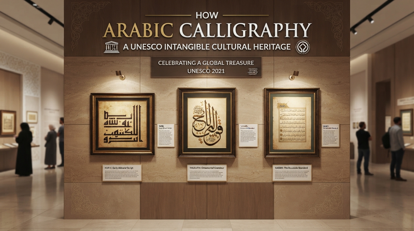
Arabic calligraphy's status as a living, hand-practiced tradition isn't just historical color — it's part of why UNESCO added it to the Representative List of the Intangible Cultural Heritage of Humanity in December 2021, describing it explicitly as "the artistic practice of handwriting Arabic script in a fluid manner." That's a recognition of a craft, not a font category.
Practicing letterforms by hand builds an eye for proportion, stroke rhythm, and structure that transfers directly to reading typeset Arabic more critically. Once you can feel why a Naskh alif is measured the way it is, you'll start noticing it immediately in any typeface you look at — and you'll be able to tell the difference between a digital style that respects those classical proportions and one that's just decorative. That's a genuinely useful skill to bring back to a screen. Use hand practice to learn why letterforms are shaped the way they are, then use the Arabic calligraphy generator to see how many different typeset personalities that same underlying structure supports across Naskh, Ruq'ah, and dozens of other styles. Hand and screen aren't competing activities here — one teaches you what to look for, and the other shows you how far a single letterform can stretch while still following the rules you just spent months learning by hand.
Frequently asked questions
What tools do I need to start learning Arabic calligraphy by hand?
A chisel-tip calligraphy marker (a practical modern substitute for a hand-cut reed qalam), ink or a built-in cartridge, and practice paper with printed guide lines for checking letter proportions. A traditional reed pen and mixed ink are worth exploring later, once your basic pen control is solid.
Why do most teachers recommend starting with Naskh instead of Thuluth?
Naskh was developed specifically for clarity and consistent, measurable proportions, which makes it the most direct way to learn the underlying structure that every classical Arabic script is built on. Thuluth and Diwani are more heavily ornamental and assume you already have solid pen control, so most teaching traditions introduce them after Naskh or Ruq'ah, not before.
How long does it take to learn Arabic calligraphy?
There's no fixed timeline, but expect weeks of basic pen-control drills before individual letters look consistent, and months of repetition before full words hold proper proportions. Traditional certification (ijazah) historically took years of staged training under a master, though that's a mastery benchmark, not what's needed to start enjoying the practice.