Every stroke in Arabic calligraphy, past and present, still answers to a tool almost no modern designer ever touches: a length of dried reed, cut at an angle by hand. That sounds like a piece of trivia until you look at what the cut actually does — because the physical geometry of that reed nib is the direct, mechanical reason Thuluth looks dramatically different from Kufic, and it's still the reference point digital type designers study when they draw Arabic webfonts today, centuries after anyone touched a physical pen to the letterforms they're digitizing.
What a qalam actually is, and how it's cut
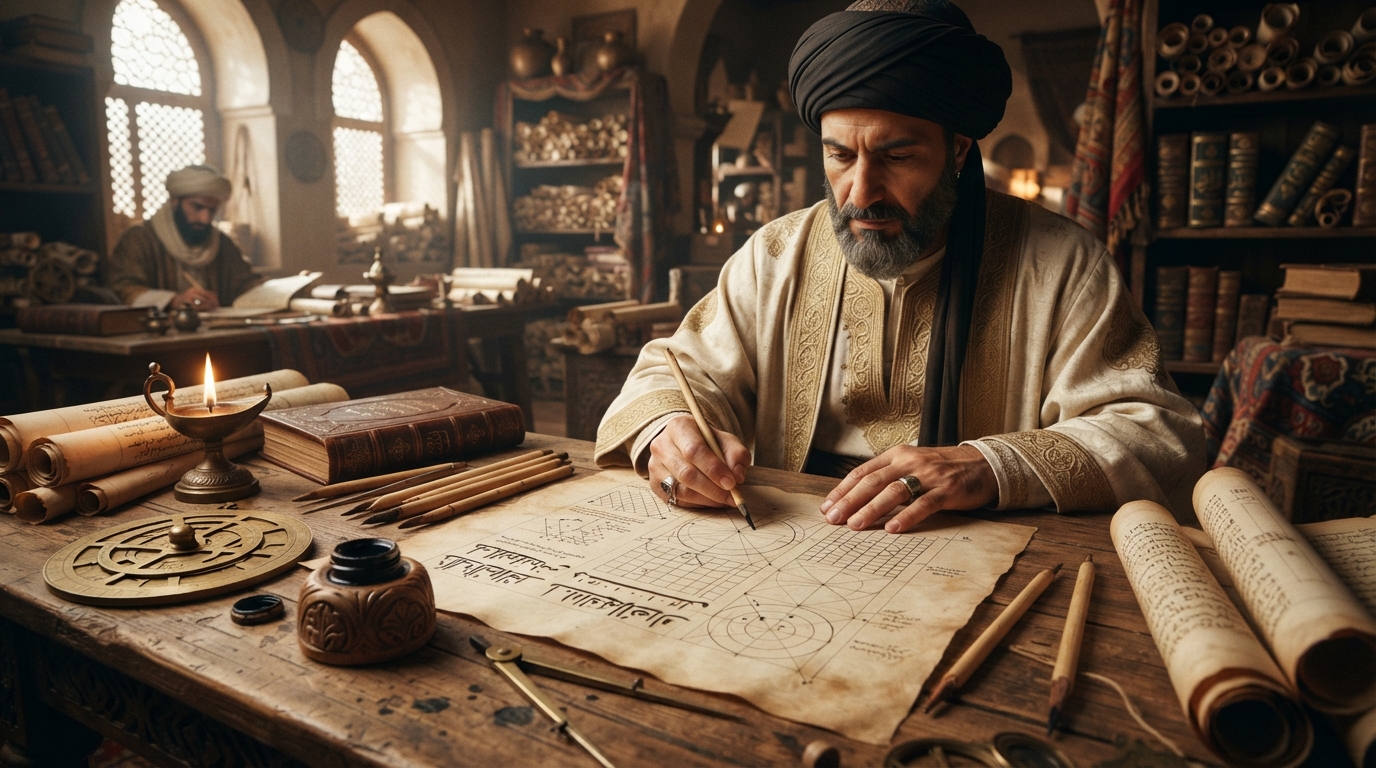
A qalam, per Encyclopaedia Britannica's entry on the tool, is "cut from between two nodes of the stem of a reed chosen for its straight fibres" — a section roughly finger-thick and eight to ten inches long. The reed is soaked and sun-dried before the tip is shaped: the thicker end is sliced off at an angle, and an ink-slot is cut into the resulting tip, producing a nib that Britannica describes as resembling "that of a steel pen." That last comparison is a useful anchor if you've ever used a broad-edged calligraphy nib — a qalam works on the same basic principle as a flat-cut dip pen, not a brush.
Crucially, that cut isn't standardized across all Arabic calligraphy. Britannica notes that "separate nibs were shaped for different calligraphic styles, their points varying in width, sharpness, angle or concavity, and position of the ink-slot." A calligrapher training in a specific script doesn't just learn hand movements — part of the craft is learning to cut and re-cut a nib to the specific angle and width that script requires, since a nib shaped for one hand will produce visibly wrong proportions in another.
Nib geometry is the mechanical reason for stroke contrast
This is the part that explains why Arabic scripts look the way they do, rather than just describing that they do. A flat-cut nib held at a roughly constant angle to the baseline doesn't vary its mark by pressure the way a brush does — it varies by direction. Pull the pen in a direction roughly perpendicular to the cut edge and the full width of the nib touches the page, producing a thick stroke; pull it in a direction closer to parallel with the edge and only the thin edge makes contact, producing a hairline. The dramatic thick-to-thin swing that defines a script like Thuluth isn't calligraphic flourish layered on top of the letters — it's what a fixed-angle flat nib physically does as the hand changes direction through a curve.
This is exactly the mechanic modern Arabic type designers still study directly, according to Communication Arts' overview of Arabic type design principles: designer Lara Captan is quoted describing how, in Naskh, "the rotating nib cut at 45 degrees creates the characteristic thin-thick stroke modulation," and that understanding how this was done in the sources is what lets a type designer make informed decisions about where contrast belongs in a digital letterform — rather than copying the visual result without understanding the mechanism that produced it.
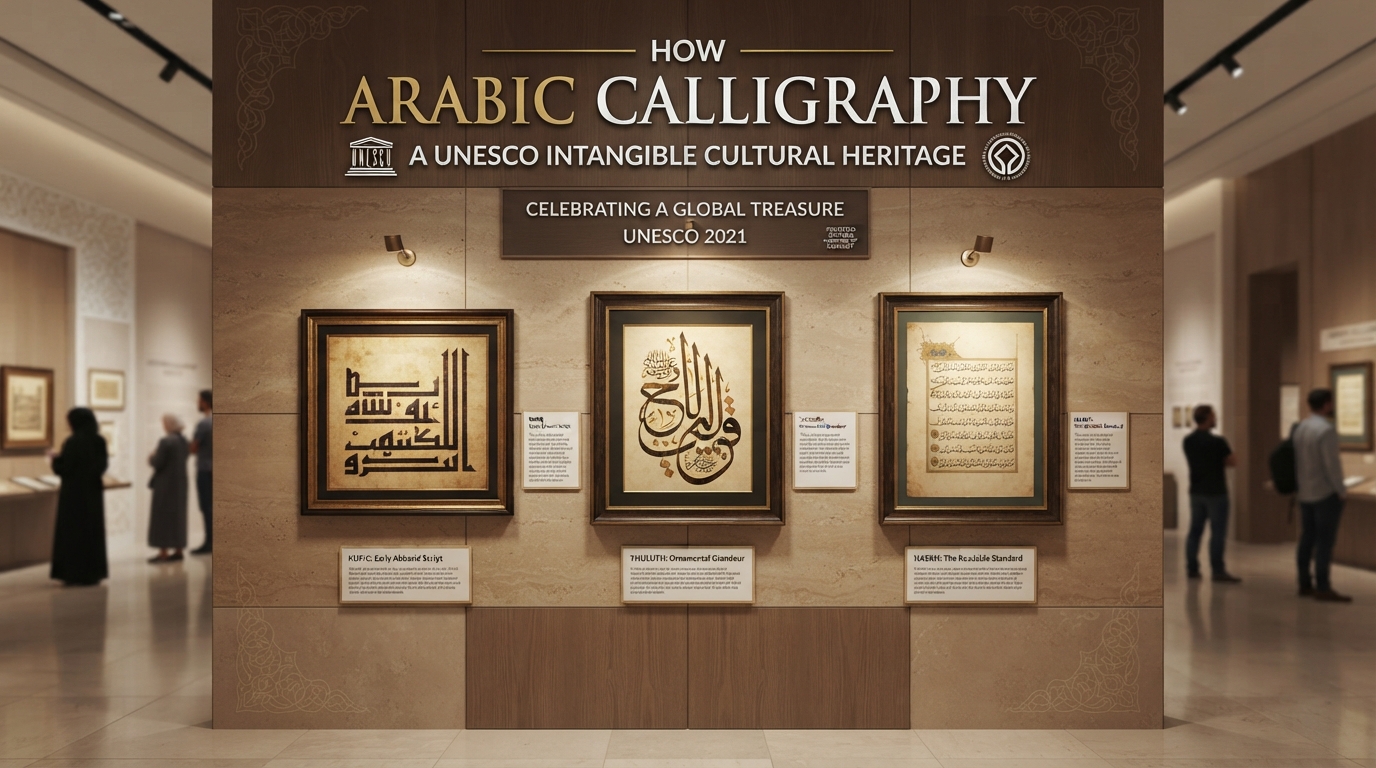
Thuluth pushes that same mechanic further than most scripts. Per its Wikipedia entry, the name itself is usually explained as meaning "one-third," most commonly because roughly a third of each letter slopes at an angle — and the script is described as replacing "the straight angular forms of Kufic" with sweeping "curved and oblique lines." Long, deep curves and dramatic proportion swings are exactly the kind of motion that maximizes a flat nib's thick-thin range, which is part of why Thuluth reads as the more monumental, decorative cousin of the more workmanlike Naskh — the tool's contrast is being deliberately exploited at scale, often for large-format work like mosque inscriptions and Qur'anic chapter headings.
Kufic: when the tool served geometry instead of flow
Kufic runs on the opposite logic. Britannica's entry on Kufic script describes it as an "angular, slow-moving, dignified script" that developed in Kufa, an early center of Islamic scholarship in present-day Iraq, and that it's the script the earliest surviving Qur'ans — from the 8th to 10th centuries — were copied in, before later evolving into decorative variants like floral and foliated Kufic once it had largely fallen out of everyday use by around the 12th century. Britannica also notes its unusually broad reach beyond manuscripts: Kufic appears "on tombstones and coins as well as for inscriptions on buildings," a versatility that tracks with its geometry. Straight lines and consistent right angles, built from deliberate, controlled pulls of a flat-cut nib, translate far more directly into carved stone or cast metal than a fast, continuous cursive hand does — which is a large part of why Kufic became the script of choice for monumental and durable media long before Thuluth's sweeping curves became the norm for that kind of decorative, large-scale work.
Ink was part of the same craft
The pen wasn't the only material variable. Historical black inks used in the Arabic and Persian manuscript tradition were often carbon-based — soot, traditionally collected as lamp-black from burned oil, ground into a binder of gum arabic — as documented by the Bodleian Libraries' conservation notes on historical black inks. That soot-based ink sat on the surface of the page rather than penetrating it chemically, which made it stable but vulnerable to abrasion and water — a real practical tradeoff against the alternative, iron-gall ink, which bonded into the paper fibers for permanence but was acidic enough to damage the page over time. Master calligraphers sometimes blended the two approaches for a more durable, versatile ink. None of this was incidental to the art: ink consistency, exactly like nib angle, determined how a stroke actually behaved on the page, and getting it wrong could undo the precision of a well-cut qalam.
Why digital type designers still study a tool they never touch
The obvious question is why any of this matters once a typeface is being drawn in vector software on a screen, with no reed or ink involved anywhere in the process. The answer, per the Communication Arts piece, is that Arabic type design remains rooted in the logic of the hand that originated it, even when the execution is entirely digital. Designer Kristyan Sarkis puts it directly: "Type is rooted in writing, even in the most constructed of typefaces." The classical rhombic-dot proportion system that calligraphers used to measure letter height and width against the qalam's own nib width is still referenced by contemporary designers — not as a rigid rulebook, but as what the Communication Arts piece calls a flexible "guideline," adapted for modern needs while keeping the underlying logic intact.
That's the actual throughline from a 1,300-year-old reed pen to a modern Arabic webfont: the pen is gone, but the geometry it imposed — where a stroke gets thick, where it stays thin, how a curve is proportioned against a letter's height — is still the reference every serious digital Arabic typeface gets checked against. A typeface that ignores that logic tends to look wrong to anyone trained to read Arabic, even if a non-Arabic-reading viewer can't immediately say why. That's also, practically, one reason it's worth using display-ready Arabic webfonts that were actually drawn with this history in mind rather than mechanically adapted from a Latin skeleton — the difference shows up exactly in the stroke logic this whole tradition is built on. For more on how the classical scripts developed and where they sit relative to each other, the site's guides to Thuluth and Kufic script in Islamic architecture are natural next reads.
Frequently asked questions
What is a qalam made from?
A qalam is traditionally cut from a section of reed chosen for straight fibers, roughly finger-thick and eight to ten inches long, soaked and dried before the tip is sliced at an angle and an ink-slot is cut into it. The resulting nib functions similarly to a flat-cut steel dip pen.
Why does Thuluth have such dramatic thick and thin strokes?
A flat-cut nib held at a roughly constant angle produces its widest mark when moving in a direction near-perpendicular to the cut edge, and its thinnest mark when moving closer to parallel with it. Thuluth's sweeping curves and long diagonal strokes are built to exploit that range, which is a large part of why the contrast looks so pronounced compared to more restrained scripts.
Why is Kufic so angular compared to later Arabic scripts?
Kufic developed for early manuscripts and was also widely used on coins, tombstones, and building inscriptions, and its straight lines and consistent angles translate directly into carving and casting in ways a fast cursive hand does not, which likely contributed to its long use as a monumental and decorative script.
Do digital type designers actually reference the qalam when drawing modern Arabic fonts?
Yes. Contemporary Arabic type designers describe studying historical pen mechanics, including nib angle and the classical rhombic-dot proportion system, to make informed decisions about stroke contrast and letter proportion in digital typefaces, even though no physical pen or ink is involved in the process.