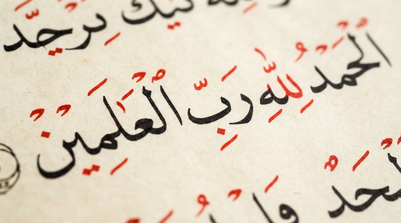
Most of what gets written in Arabic today — news articles, novels, street signs, text messages — leaves the vowels out. That's not a shortcut for casual writing; it's the normal, literate way adult Arabic is written, the same way a fluent English reader doesn't need every silent letter spelled out to understand a word. But those vowel marks, called harakat, haven't disappeared. They still exist, they still follow precise rules, and in a handful of contexts — the Qur'an, children's books, dictionaries, and anywhere a misread could change a name's meaning — they're essential. Here's what each mark actually does, and when a designer should use them.
What Harakat Are
Arabic is written using a core set of letters, called the rasm, that carries the consonant skeleton of a word. Harakat (حركات, literally "movements") are the small marks layered above or below those letters to show short vowels and a few other grammatical details. Wikipedia's overview of Arabic diacritics describes this system, known as tashkil when applied in full, as the layer that turns an unvocalized consonant skeleton into a fully readable, unambiguous text. Most everyday Arabic writing skips this layer entirely and relies on the reader's fluency and context to fill in the gaps.
The Three Short Vowels: Fatha, Kasra, Damma
Arabic has three short vowel marks, each named for the mouth movement it represents:
- Fatha (فَتْحَة) — a small diagonal stroke above a letter, representing a short "a" sound. The name means "opening," describing the mouth position.
- Kasra (كَسْرَة) — the same diagonal stroke, placed below the letter instead of above it, representing a short "i" sound. The name means "breaking."
- Damma (ضَمَّة) — a small loop-like mark above a letter, resembling a tiny waw, representing a short "u" sound. The name refers to the lip-rounding needed to pronounce it.
Placed before a plain alif, ya, or waw respectively, these same marks combine with those letters to signal the corresponding long vowel instead of a short one — part of why vowel length carries real grammatical weight in Arabic in a way English speakers don't usually track consciously.
Sukun: Marking the Absence of a Vowel
Not every consonant carries a vowel. Sukun (سُكُون) is a small circle placed above a letter to explicitly show that it has no vowel at all — the syllable simply ends on that consonant sound. It's a necessary mark in a language built around consonant-vowel-consonant syllable patterns, because without it a reader vocalizing an unfamiliar or fully-marked word wouldn't know where a syllable stops.
Shadda: Doubling a Consonant
Shadda (شَدَّة), shaped like a small Latin "w" sitting above a letter, marks gemination — pronouncing a consonant doubled, or held for longer than usual. It changes meaning: a root pronounced with a plain consonant and the same root with a doubled one are often entirely different words. Shadda is worth calling out specifically because, per Wikipedia's diacritics overview, it's "the only ḥarakah that is commonly used in ordinary spelling to avoid ambiguity" — meaning even writers who skip every other vowel mark will often still add a shadda where leaving it out would genuinely confuse a reader.
Tanwin: The Grammar Marks at the End of a Word
Tanwin (تَنْوِين), or nunation, is a set of three doubled vowel marks — fathatan (ـً), dammatan (ـٌ), and kasratan (ـٍ) — added to the final letter of certain nouns and adjectives. Each adds an "-n" sound to the vowel it's based on and signals grammatical case in Classical and Modern Standard Arabic: fathatan for the accusative, dammatan for the nominative, and kasratan for the genitive, typically on indefinite nouns. It's a piece of Arabic's case system that, like the short vowels, is almost always silently understood rather than written out in everyday text.
Why Modern Arabic Drops the Vowels
The earliest Arabic script had none of this. Qur'anic manuscripts from the first Islamic century were written with bare consonant skeletons and no dots to distinguish similarly shaped letters, let alone vowel marks — workable for readers who already knew the text by heart, risky as Islam spread to new, non-native Arabic speakers without that context.
The fix is credited to a specific figure: Abu al-Aswad al-Du'ali, a 7th-century scholar in Basra. According to Wikipedia's account of his work, he developed his system after hearing a Qur'anic verse recited with the wrong grammatical case ending, changing its meaning. He reportedly instructed a scribe to mark a dot above a letter whenever he opened his mouth to read it, and a dot elsewhere for other vowel sounds — an early, cruder ancestor of the fatha, kasra, and damma used today. That dot-based system was later refined into the lighter, more legible marks still used now, generally credited to the 8th-century lexicographer al-Khalil ibn Ahmad al-Farahidi.
Once literate adult readers no longer needed that level of scaffolding for ordinary text, the marks became optional for anyone fluent enough to infer vowels from grammar and context — which is exactly the state modern everyday Arabic writing is in today.
Where Full Vocalization Still Matters
Harakat haven't gone anywhere; they're reserved for specific situations where ambiguity is unacceptable or the reader can't be assumed to already know the word:
- The Qur'an, where precise recitation and meaning are non-negotiable and every mark is preserved.
- Children's books and beginner learning materials, where a reader hasn't yet built up the vocabulary to guess vowels from context.
- Dictionaries, where headwords are fully vocalized specifically to show correct pronunciation.
- Poetry and some classical or religious texts, where meter and precise recitation depend on knowing exact vowel sounds.
When a Designer Should Add Diacritics
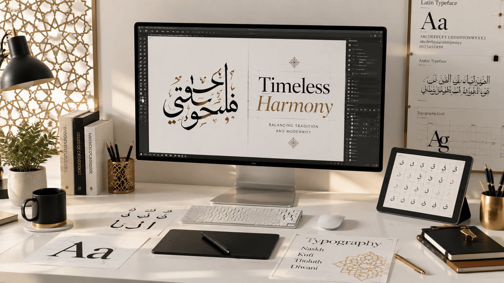
This is where it connects directly to calligraphy and design work. An unvocalized word is fine when the reader already has enough context to fill in the gaps — a sentence in a paragraph, a familiar phrase. It becomes a real problem the moment a word is pulled out of context and stands alone, which is exactly the situation with a name rendered in calligraphy, a short phrase on a poster, or text permanently inked as a tattoo.
Our guide to writing names in Arabic calligraphy covers this in more depth, but the short version is: names are exactly the kind of word a reader can't infer from surrounding context, because there usually isn't any. The same caution applies even more strongly to the Arabic calligraphy tattoo guide — a mistake in a social media graphic can be corrected; one inked permanently cannot, and a missing or wrong diacritic is a common way an intended name or phrase ends up misread.
A practical rule of thumb: if the text will be read alongside other Arabic content that supplies context, everyday unvocalized style is fine and matches how fluent readers actually write. If the text stands alone — a name, a short quote, a single word turned into wall art — add the essential harakat, or have a native Arabic speaker confirm the reading before finalizing the design.
Getting the Marks Right in a Font Tool
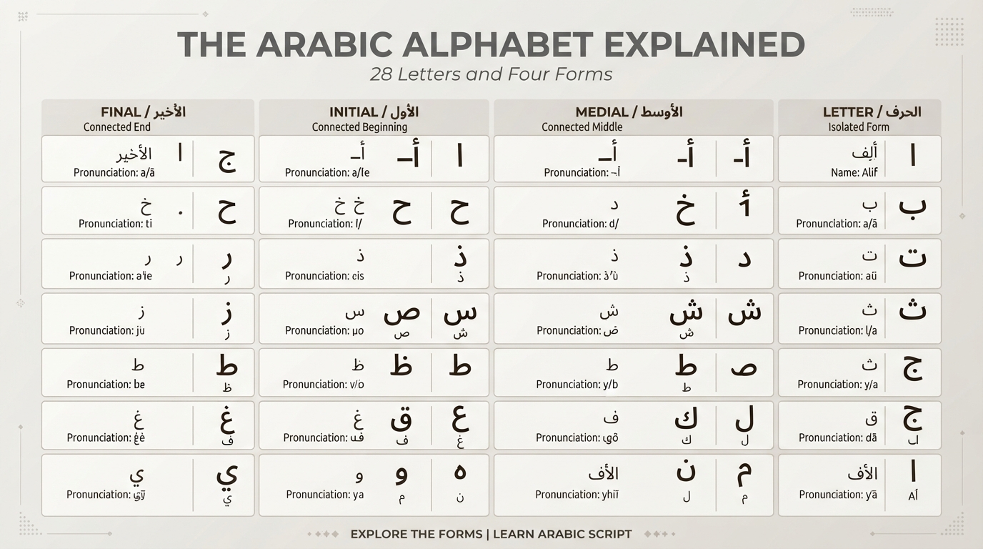
Diacritics are technically demanding for font design, because each mark has to sit correctly above or below its base letter regardless of which of the four positional forms that letter is currently using — a fatha sitting over a letter's medial form needs different vertical placement than the same fatha over its final form. When previewing a design with harakat included, check that the marks are vertically aligned and not colliding with letter connectors; our generator includes diacritics support specifically so this can be checked before a design is finalized rather than after.
Frequently asked questions
Is Arabic normally written without vowels?
Yes. Everyday Arabic — news, novels, signage, texting — is typically written without harakat, and fluent readers infer the short vowels from context and grammar, similar to how English readers don't need every word phonetically spelled out.
What's the difference between sukun and shadda?
Sukun shows that a consonant has no vowel following it at all. Shadda shows that a consonant is doubled, or pronounced longer than usual. They mark opposite things and are never placed on a letter at the same time for the same purpose.
What is tanwin and why does it matter grammatically?
Tanwin, or nunation, is a set of three marks — fathatan, dammatan, kasratan — added to the end of certain indefinite nouns to show grammatical case: accusative, nominative, and genitive. It's part of Classical and Modern Standard Arabic's case system and is usually left unwritten in casual text.
Should a name be written with diacritics for a tattoo or logo?
Generally yes, or at minimum verified by a native Arabic speaker. A standalone name has no surrounding sentence to supply context, so an unvocalized version is genuinely more likely to be misread than the same word inside a full paragraph.