Anyone who has typed a phrase into an Arabic font generator has probably hit this moment: the letters look right individually, but strung together they seem to fall apart, or a shape appears that doesn't match what you expected from the keyboard. That's rarely a bug in the tool. It's usually the Arabic writing system doing exactly what it's designed to do, and the software either handling it correctly or not. Understanding the mechanism — why Arabic letters change shape, and why some refuse to connect at all — is the fastest way to tell a genuine rendering problem from normal Arabic orthography, and it's the root cause behind the single most common mistake documented in this site's guide to 7 Common Arabic Typography Mistakes.
Here's how the 28-letter Arabic alphabet actually works.
Twenty-Eight Letters, Not Twenty-Eight Sounds
The standard Arabic alphabet has 28 letters, and all 28 originally represent consonants (three of them — alif, waw, and ya — also do double duty marking long vowels in certain positions). Short vowels aren't separate letters at all; they're optional diacritical marks added above or below a letter, a system covered in full in our guide to Arabic diacritics. That count is confirmed by the Encyclopaedia Britannica entry on the Arabic alphabet, which describes the script as "28 consonants" with vowels handled through diacritical marks, and by Wikipedia's overview of the Arabic alphabet, which puts the base count at 28 letters as well.
This matters for typography because it means an Arabic font has to do more than map one glyph per letter. Every one of those 28 letters needs several versions of itself, because Arabic is a joined script by default.
Arabic Script Is Cursive by Default
In English, cursive is a style choice — print and script are both valid, and most digital text uses print-style disconnected letters. Arabic doesn't have that option. Both handwritten and standard printed or digital Arabic are cursive: letters within a word connect to their neighbors by default, similar to linked handwriting, except this joined structure is the normal, expected form rather than a stylistic variant. Wikipedia's overview of the Arabic script puts it plainly: most letters "are written in slightly different forms according to whether they stand alone or are joined to a following or preceding letter."
That single fact is why Arabic fonts are so much more complex to build than Latin ones, and why a font or generator tool that doesn't implement text shaping properly will produce broken-looking output even when every individual letterform in the font file was drawn well.
Every Connecting Letter Has Up to Four Shapes
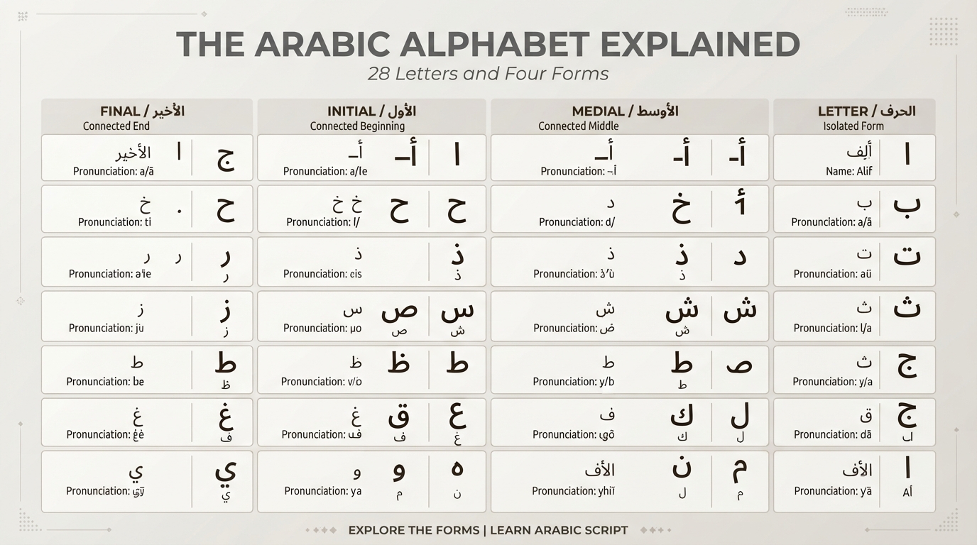
Because letters join their neighbors, most Arabic letters change shape depending on where they sit in a word. Typographers and the Unicode Standard describe this with four positional categories, sometimes abbreviated IMFI:
- Isolated — the letter standing completely alone, not connected to anything
- Initial — the letter starts a word and connects only to what follows it
- Medial — the letter sits in the middle of a word and connects on both sides
- Final — the letter ends a word and connects only to what precedes it
The Unicode Standard's core specification formalizes exactly how a rendering engine decides which of these four shapes to draw for a given letter, based on whether the neighboring characters are themselves capable of joining on that side — the spec calls this a letter's "joining type." A letter like ba' (ب), one of the most common in the alphabet, looks meaningfully different in each of its four positions, even though it's encoded as a single character in the underlying text. The visual differences aren't decorative variety; they're required by the writing system, and a correctly built font needs a distinct glyph, or a shaping rule, for each one.
This is also why simply picking individual letters off a virtual keyboard and placing them side by side, the way you might lay out Latin letters in a design tool, doesn't work for Arabic. The correct positional glyph for each letter depends on its neighbors, so a tool has to evaluate the whole word, not just each character in isolation, before it knows which of the four shapes to draw.
The Six Letters That Break the Chain
Not every letter connects the same way in both directions. Six letters in the Arabic alphabet — alif (ا), dal (د), dhal (ذ), ra (ر), zay (ز), and waw (و) — only ever connect to the letter before them. They never connect forward to the letter that follows. Wikipedia's alphabet overview confirms this directly: these letters "can only be linked to their preceding letter," which means whatever comes immediately after one of them in a word has to start fresh, appearing in its initial or isolated form rather than continuing an unbroken chain.
This creates small, deliberate visual breaks inside words that are completely correct — not gaps caused by bad kerning or a missing glyph. If you've ever looked at a word rendered in Arabic and wondered why there's a slight disconnect partway through it, this is almost always the answer: one of these six letters just did its job.
Why This Is the Root of "Common Mistake #1"
This site's guide to common Arabic typography mistakes lists broken letter connections as the single most frequent problem in Arabic design work, and the joining behavior described above is exactly why it happens. Proper Arabic text rendering depends on a shaping engine that reads the Unicode joining-type data assigned to each character — classified as dual-joining, right-joining, or non-joining — and automatically substitutes the correct isolated, initial, medial, or final glyph based on its neighbors. Software with weak or absent Arabic shaping support skips this step and falls back to isolated forms for everything, which produces that telltale "disjointed" look where every letter sits separately instead of flowing together. It's the same underlying mechanism font engineers manage through OpenType features built specifically for Arabic script.
What This Means When You're Choosing a Font or Generator
None of this needs to be memorized letter by letter. The practical takeaways are simpler:
- Always preview real words, not isolated letters. A font can render every individual character correctly and still fail to connect them. Test actual phrases, not single glyphs.
- Don't assume a visual break is an error. If it lands right after an alif, dal, dhal, ra, zay, or waw, that gap is supposed to be there.
- Use tools built for Arabic shaping. Generic design software without proper complex-script support is where connections break down most often; a generator built around Arabic script, like our font generator, applies the correct positional forms automatically across its full library.
- When precision matters — logos, names, permanent pieces — get a second look from someone who reads Arabic. Shaping engines get the mechanics right; only a fluent reader can confirm the finished result actually looks natural, a point covered further in our typography guide for non-Arabic speakers.
Once you know the alphabet is built around 28 letters, four positional forms, and six letters that don't connect forward, the "why does this look broken" question mostly answers itself — and you'll be able to tell in seconds whether you're looking at correct Arabic orthography or a genuine rendering bug. That distinction is worth being confident about before a design ships, whether it's a single word on a poster or a full paragraph of body text, because "it looked fine in the editor" isn't the same guarantee in Arabic that it is in a script where every letter keeps the same shape no matter what sits next to it.
Frequently asked questions
How many letters are in the Arabic alphabet?
The standard Arabic alphabet has 28 letters, all originally representing consonant sounds. Short vowels are added separately as diacritical marks rather than counted as letters of the alphabet.
Do all Arabic letters connect to the letters around them?
Most do, but six letters — alif, dal, dhal, ra, zay, and waw — only connect to the letter before them, never to the one that follows, which creates natural breaks inside words.
Why does the same Arabic letter look different in different words?
Arabic is a cursive script by default, so most letters have up to four shapes (isolated, initial, medial, final) depending on their position in a word and which neighboring letters they connect to.
If Arabic text looks disconnected or broken in a design tool, is that a mistake?
Usually yes. It typically means the software isn't applying proper Arabic text shaping and is falling back to isolated letterforms for every character. Test the same text in a tool built for Arabic script to see the correctly connected version.