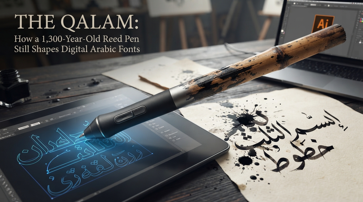
A calligraphic Arabic design that looks stunning to a sighted visitor can be functionally invisible to someone using a screen reader — not because the design is bad, but because to assistive technology, an image is just an image. This matters more for Arabic calligraphy than for most Latin typography, because calligraphic Arabic is so often published as a picture — an SVG or PNG export of a stylized name, a verse, or a quote — rather than as live, selectable text. Here's what that actually breaks, and what fixes it.
The core problem: calligraphy as an image has no text in it
Screen readers read the DOM: real characters, plus the attributes attached to them. A PNG or SVG "picture" of calligraphy, however beautifully rendered, is made of pixels or vector paths, not characters a text-to-speech engine can parse — unless the SVG happens to contain actual <text> elements, which most calligraphic art doesn't, since outlines are typically converted to paths for design flexibility. Functionally, an unlabeled calligraphy image and a blank image are identical to a screen reader.
W3C's Web Accessibility Initiative is specific about what to do when an image contains text: "the text alternative must contain the same text presented in the image." That's a stricter bar than a generic description. Alt text like alt="beautiful Islamic calligraphy pattern" tells a screen reader user that something decorative exists, but it doesn't convey what the calligraphy actually says — and the words are usually the entire point of a calligraphic design, not an incidental detail. The practical rule: if an image's content is a specific word, name, or phrase rendered artistically, the alt attribute should contain that actual text (transliteration or a short translation alongside it is a reasonable addition for context), not a vague description of the artwork's style.
That said, not every calligraphic flourish on a page is meaningful content. W3C's guidance on decorative images is equally direct about the other case: purely decorative images — a background flourish repeating information that already exists as real text elsewhere on the page — should get a null alt="" so screen readers skip them instead of adding "audible clutter." The distinction that matters is whether the image is the content or merely decorates content that exists elsewhere in accessible form. A hero image of a client's name in Thuluth script on a wedding invitation site is content; a repeating calligraphic border pattern around a page that already states the couple's names in real text is decoration.
The same W3C guidance also flags a middle case worth knowing about: logos. A wordmark rendered as calligraphy is treated as an image of text, but it's exempted from some of the general requirements around images of text (such as being resizable without an image) precisely because a logo's specific visual form is the point. Even there, though, the accessibility expectation doesn't disappear — the alt text should still name what the logo actually says, typically the organization or brand name, rather than being left blank or reduced to something generic like "logo."
Why images of real text are the exception, not the default
Beyond alt text, the W3C's broader position on images of text is worth internalizing even if it doesn't change what you build today: real, styled, selectable text is preferable to an image of text whenever it's achievable, because it scales, recolors, and reflows for each visitor instead of behaving like a fixed picture. Calligraphic Arabic is a legitimate exception to that general preference — the artistic form genuinely can't be reproduced with ordinary live text and CSS the way a heading can — which is exactly why the alt-text discipline above matters more here than it does for most typography on the web. When an image is doing work that live text can't, the alt attribute is the only bridge back to that same content for someone who can't see the image at all.
Language attributes: why lang="ar" isn't optional
Getting the words into the alt text solves half the problem. The other half is telling assistive technology what language those words — and the page's real text — are actually in. WCAG's Language of Page success criterion (3.1.1, Level A) requires that a page's primary language be programmatically determinable, normally via the lang attribute on <html>; the related Language of Parts criterion (3.1.2, Level AA) extends that to marking language changes within a page.
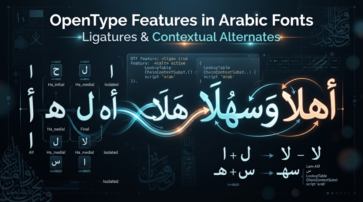
The practical reason this matters, per WebAIM's guidance on document and content language: "Screen readers can 'speak' various languages — as long as the content language is identified." Without lang="ar" set correctly, assistive technology has no reliable way to know it should switch to an Arabic-pronunciation voice, and may instead attempt to sound out Arabic characters using rules built for a different language — producing output that's meaningless rather than merely mispronounced. For a bilingual page — say, a business site that pairs Arabic and Latin typefaces — that means marking the switch inline, wrapping the embedded English phrase in <span lang="en"> inside an Arabic-language page (or the reverse), so the reader's pronunciation engine switches at the right point rather than reading the whole paragraph in one language's rules.
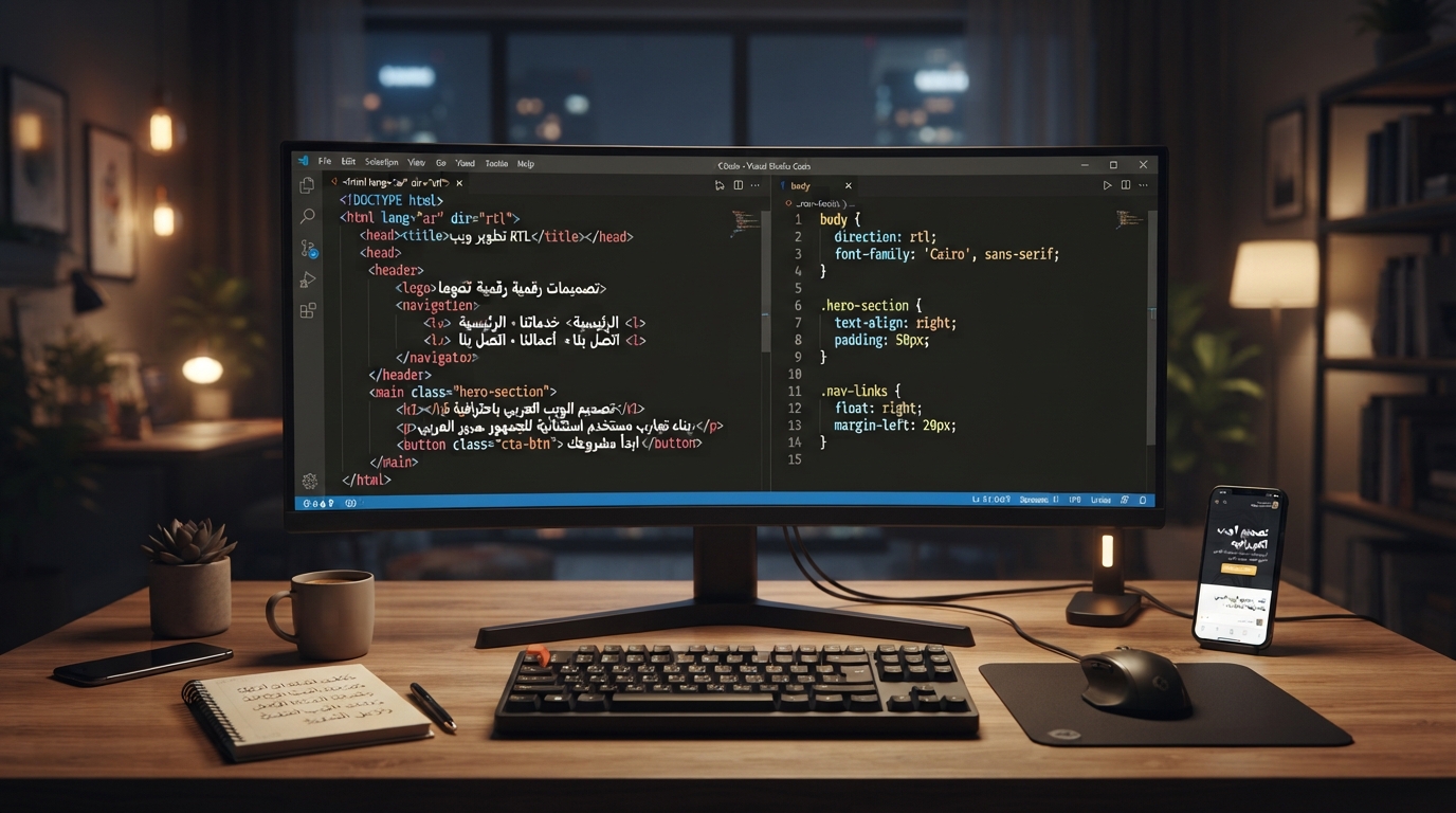
It's worth being precise about how this relates to the dir attribute: dir and lang do different jobs, and neither substitutes for the other. dir controls layout and reading order; lang controls pronunciation and voice selection. An Arabic page needs dir="rtl" and lang="ar" set correctly — setting only one leaves either the visual layout or the audio output wrong.
Diacritics and the risk of losing meaning when read aloud
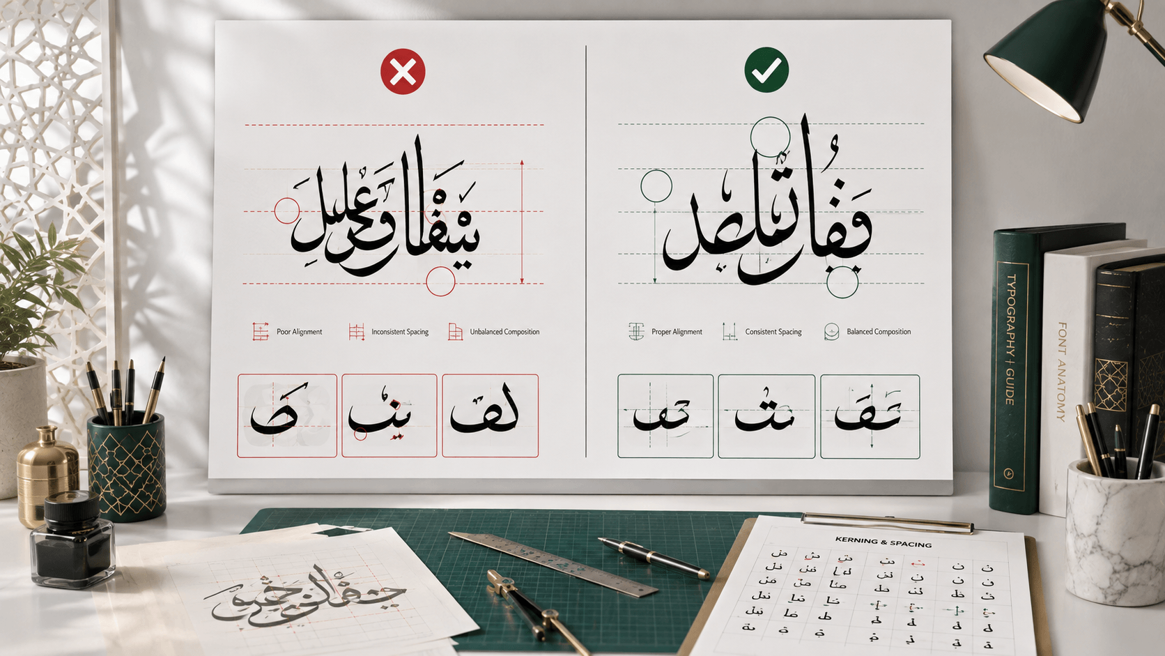
Arabic's short-vowel diacritics (ḥarakāt) carry information that consonant letters alone don't — the same sequence of base letters can be entirely different words depending on which diacritics are added. Most everyday Arabic text omits them, and readers infer the intended word from context, the way an English reader doesn't need every possible ambiguity spelled out either. But the ambiguity is real: the site's complete guide to Arabic diacritics goes deeper on how these marks work, but the accessibility-relevant point is narrower — the same context-dependent ambiguity that a fluent human reader resolves automatically isn't guaranteed to resolve the same way for a text-to-speech engine reading in isolation, without the surrounding visual and situational cues a human brings to the page.
That doesn't mean every word needs diacritics added. It means that for content where a genuine ambiguity exists and precision matters — religious text, poetry, instructional material, or any specific word that would otherwise be read two different ways — including the diacritics in the actual underlying text (not just visually baked into an image) gives both sighted readers and assistive technology the same disambiguating information a human reader would otherwise have to guess at.
Why this matters practically for anyone publishing calligraphy online
If you're using a tool like this site's Arabic calligraphy generator to turn a name or phrase into a styled image — for a business card, a social graphic, or a page hero image — the accessibility checklist is short and doesn't require redesigning anything:
- Alt text should contain the actual words, not a generic description like "Arabic calligraphy design."
- Set
langcorrectly, both at the document level and inline wherever the language switches within mixed content. - Preserve diacritics in real text where a word's meaning genuinely depends on them, rather than relying on an image to convey a distinction that plain text alone won't carry.
- Test with an actual screen reader — VoiceOver or NVDA, not just a visual review — before publishing.
None of this requires abandoning calligraphic images in favor of plain text; it just requires making sure the meaning inside the artwork also exists somewhere a screen reader can reach it. For more on how the underlying script itself works — which is useful background for writing accurate alt text in the first place — the site's guides on common Arabic typography mistakes and Arabic typography for non-Arabic speakers are both good starting points.
Frequently asked questions
What should alt text say for an image of Arabic calligraphy?
It should contain the actual text the calligraphy spells out, ideally with a transliteration or short translation for context, rather than a generic description like "Arabic calligraphy artwork." The words are usually the entire content of a calligraphic image, so the alt text needs to convey them, not just describe the style.
Do I still need lang="ar" if my page already has dir="rtl"?
Yes. dir and lang control different things: dir sets layout and reading direction, while lang tells assistive technology which pronunciation rules and voice to use. Screen readers need both set correctly, and one does not substitute for the other.
Should diacritics (harakat) be included for accessibility?
Include them in the real underlying text when a word's meaning is genuinely ambiguous without them, such as in religious text, poetry, or instructional material. Most everyday Arabic text omits diacritics safely because context resolves the ambiguity, but that same ambiguity can trip up a text-to-speech engine reading in isolation.
Is an SVG more accessible than a PNG for calligraphy?
Only if the SVG contains real text elements or accessible metadata like a title or description. An SVG built from outlined vector paths, which is how most calligraphic art is exported, is no more readable to a screen reader than a PNG. What matters is providing the actual words through alt text, not the file format.